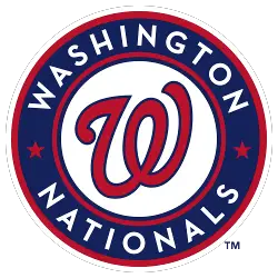
Washington Nationals
The new current Washington logo is a red curly “W” with a blue outline in the middle of a white background and inside a blue circle with red outlines, two red stars, and a wordmark “WASHINGTON NATIONALS” in white.
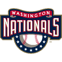
Washington Nationals
2005 - 2011
The new Nationals logo is a wordmark "NATIONALS" in white with gold beveling and a red outline on blue background with a white and red seams baseball and 9 white stars below and red ribbon above with the wordmark "WASHINGTON" in white.
Montreal Expos
1992 - 2004
The “eMb” or “M” logo in red, white and blue on top of a white with red seams baseball inside a red and blue ring with a wordmark “MONTREAL EXPOS” in white lettering.
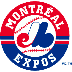
Montreal Expos
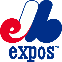
1969 - 1992
For almost 40 years the team held on to this awesome logo because it was smart and looked great from Expos de Montreal Baseball. Interwoven script pieces all come together to abbreviate the full name of the team. "eMb" in red white and blue forming a "M." A wordmark "expos" in blue at the bottom.
Washington Nationals Logo History: From Past to Present! Logo History Highlights!
In this video, we explore the history of the Washington Nationals logo, tracing its evolution from the past to the present. We take a closer look at how the logo has changed over the years, reflecting the team's growth and identity.
The Bold Washington Nationals Logo
The Washington Nationals logo energizes Washington Nationals logo baseball games. Rooted in Washington Nationals logo history, it fuels fan pride. Furthermore, Washington Nationals logo PNG files thrill collectors. Visit the official Washington Nationals MLB page. Discover the team’s legacy and updates. Therefore, fans connect with Nationals spirit.
Baseball Sports Fan Products