Florida Marlins
1993 - 2011
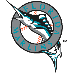
The Marlin's first logo consisted of a marlin jumping out of a silver circle with a black trim and the wordmark “FLORIDA MARLINS,” also a baseball in the background. It was unveiled in July 1991.

Florida Marlins
1993 - 2011
The Marlin's first logo consisted of a marlin jumping out of a silver circle with a black trim and the wordmark “FLORIDA MARLINS,” also a baseball in the background. It was unveiled in July 1991.
The Vibrant Florida Marlins Logo
A dynamic marlin defines the Florida Marlins logo, set against a silver circle. The Florida Marlins logo history includes the old Florida Marlins logo with teal and black hues. Fans cherish Florida Marlins logo PNG downloads for their bold style. Additionally, check the Florida Marlins alternate logo. It highlights more designs in this iconic collection.
The Florida Marlins logo energized MLB games with its coastal flair. Rooted in Florida Marlins logo history, the old Florida Marlins logo evokes nostalgia. Furthermore, Florida Marlins logo PNG files captivate collectors. Visit the official Miami Marlins MLB page. Discover the team’s legacy and updates. Consequently, fans embrace Marlins tradition.
