Chicago White Sox
The current White Sox logo has become an old English wordmark “SOX” in black and white with a silver trim. The script is in a diagonal position.
Chicago White Sox
2011 - Present
An old English wordmark “SOX” in black. The script is in a diagonal position.
The white and sliver trim is removed from the primary logo.

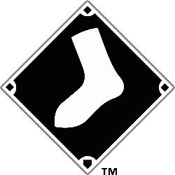
Chicago White Sox
1990 - Present
A white sock on a black baseball diamond with white and silver outline.
Chicago White Sox
1976 - 1990
The blue baseball player icon is set above “Sox” in blue.
The red wordmark “Chicago White Sox” is removed from the primary logo.

Chicago White Sox
1971 - 1975
"Sox" in white with light blue border over a white sock in a filled in red circle.

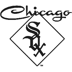
Chicago White Sox
1971 - 1975
An old english font "SOX" in black inside a black diamond with Chicago scripted above in black.
Chicago White Sox
1951 - 1963
An olde English font "SOX" stacked diagonally in black with a red outline.

Chicago White Sox
1949 - 1970
White sock with a wing in a yellow circle with a black border and "Chicago" scripted toward the bottom of the circle.

Chicago White Sox
1920 - 1921
Two crossed white socks with blue trim.

Chicago White Sox Logo Evolution! Shocking Secrets Unveiled!
A fascinating video that takes you on a journey through the logo evolution of the Chicago White Sox, one of the oldest teams in Major League Baseball. The video examines every iteration of the team's logo from its inception, unraveling surprising secrets and the stories behind each transformation. It uncovers the design inspiration, historical context, and the fan reactions that accompanied each change. From the original 'sox' logo to the modernized, sleek black, white, and silver emblem we see today, the video provides a comprehensive and engaging exploration of the team's visual identity. Whether you're a White Sox fan, a graphic design enthusiast, or a baseball history buff, this video offers a unique perspective on the intersection of sports, history, and design.
The Bold Chicago White Sox Logo
Alternate Chicago White Sox logos energize Chicago White Sox MLB games. Rooted in Chicago White Sox logo history, these designs amplify team spirit. Furthermore, Chicago White Sox logo PNG files captivate collectors. Visit the official Chicago White Sox MLB page. Discover the team’s legacy and updates. Consequently, fans embrace White Sox tradition.