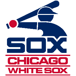
Chicago White Sox
The current White Sox logo has become an old English wordmark “SOX” in black and white with a silver trim. The script is in a diagonal position.
Chicago White Sox
1987 - 1991
The blue baseball player icon is set above "Sox" in blue. At the bottom of the logo is the wordmark "CHICAGO WHITE SOX" in red and separated with red lines. The shade of blue was darkened for the 1987 season.
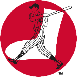
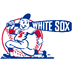
Chicago White Sox
1960 - 1976
Transparent baseball batter on top of a white sock inside red circle background. The baseball bat is coming out of the red circle background.
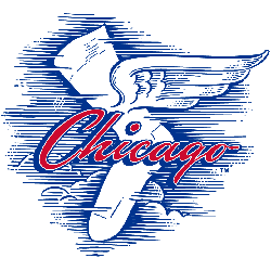
Chicago White Sox
1949 - 1960
A white sock with wings flying through the air with clouds and wind. A wordmark "Chicago" scripted across the front in red and blue.
Chicago White Sox
1939 - 1949
A baseball player carrying a blue bat with "WHITE SOX" on it in the color white, wearing a jersey with the Sox logo. A red seamed baseball is positioned behind the baseball player.

Chicago White Sox
1936 - 1939
In 1936 the White Sox changed back to the most enduring and famous logos in baseball. Again changing the style of the large "S," and the small "O" inside the top loop of the "S" and the small "X" inside the bottom loop. All again back to the color of blue.
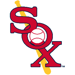
Chicago White Sox
1932 - 1936
The 1932 logo changed to red with blue outline of the wordmark "SOX" in a vertical diagonal position. A bat and baseball have been added with the baseball in the center of the letter "O" and the bat is behind the wordmark.
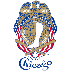
Chicago White Sox
1918 - 1932
A white sock inside a gold and blue globe, "WORLDS CHAMPIONS" arched around it with a gold eagle above with the dates 1906 and 1917. American flag banner behind it, crossed bats, a baseball, and "Chicago" script below the logo.

Chicago White Sox
1917 - 1918
In 1917 the White Sox changed the most enduring and famous logos in baseball, by changing the style of the large "S," and the small "O" inside the top loop of the "S" and the small "X" inside the bottom loop. All again in the color of blue.

Chicago White Sox
1912 - 1917
In 1912 the White Sox debuted one of the most enduring and famous logos in baseball, a large "S" in a Roman style font, with a small "O" inside the top loop of the "S" and a small "X" inside the bottom loop. All in the color of blue.

Chicago White Sox
1910 - 1912
The 1910 letter "C" White Sox logo became even more round and again in blue. Still have the hook at the top of the letter "C."

Chicago White Sox
1908 - 1910
In 1908 the Sox continued with the round letter "C" in blue. Now adding a cutout at the bottom of the "C" and added two triangles to the middle of the letter.

Chicago White Sox
1906 - 1908
The White Sox changed logos to a more round letter "C" again in blue. At the end of the "C" on the top is a little hook and the bottom "C" is straight cutoff.

Chicago White Sox
1905 - 1906
The next year the Sox changed to a different old english letter "C" in blue. A white diamond is added in center on the backside of the letter "C."

Chicago White Sox
1904 - 1905
The 1904 White Sox logo is again an old english letter "C" in blue. The tail was removed and a accent point is added in the middle of the "C" and the shape is now longitude.

Chicago White Sox
1903 - 1904
Carry over from the White Stocking is an old english letter "C" in blue.

Chicago White Stocking
1901 - 1902
The new version White Stockings logo is a blue letter "C."

Chicago White Stocking
1900 - 1901
The original White Sox logo is a red block letter "C."
Chicago White Sox Logo Evolution! Shocking Secrets Unveiled!
A fascinating video that takes you on a journey through the logo evolution of the Chicago White Sox, one of the oldest teams in Major League Baseball. The video examines every iteration of the team's logo from its inception, unraveling surprising secrets and the stories behind each transformation. It uncovers the design inspiration, historical context, and the fan reactions that accompanied each change. From the original 'sox' logo to the modernized, sleek black, white, and silver emblem we see today, the video provides a comprehensive and engaging exploration of the team's visual identity. Whether you're a White Sox fan, a graphic design enthusiast, or a baseball history buff, this video offers a unique perspective on the intersection of sports, history, and design.
The Bold Chicago White Sox Logo
In Chicago White Sox MLB games, the primary logo represents resilience. Its bold look, tied to Chicago White Sox logo history, sparks fan pride. Moreover, Chicago White Sox logo PNG files are perfect for collectors. Visit the official Chicago White Sox MLB page to learn about the team’s storied past, roster, and latest updates.
Baseball Sports Fan Products