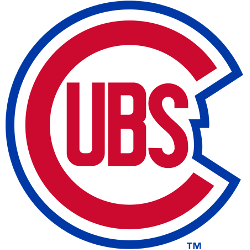
Chicago Cubs
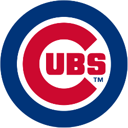
The giant “C” has become rounder inside the blue circle and more geometric while the outlines are thicker. The giant “C” has the “UBS” added inside the “C.” The blue circle has now become much thicker and bold.

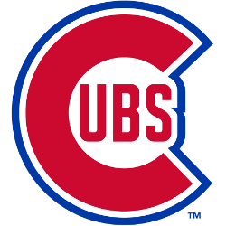
Chicago Cubs
1957 - 1979
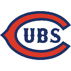
The 1957 logo removed the form fitting blue "C" outline and made the outline a complete circle around the "C." Continued with red "UBS" inside the rounded red "C" with a wide blue circle.
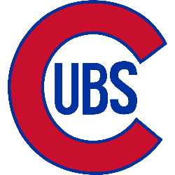
Chicago Cubs
1948 - 1957
The 1948 Cubs primary logo was changed the blue outline around the letter "C." The new outline is more jagged as it comes around the letters "UBS." Continued with red "UBS" inside the rounded red letter "C" with the blue outline.
Chicago Cubs
1945 - 1948
The Cubs changed their logo in 1941 with a form fitting outline of the rounded "C." The "C" and the wordmark "UBS" is red with the form fitting outline in blue.

Chicago Cubs
1941 - 1945
The brown head of an angry bear cub. Quite a change from the normal Cubs logo, more line the Chicago Bears logo.
Chicago Cubs
1937 - 1941
The 1936 logo is now a rounded "C" in red with a thin blue trim and the wordmark "UBS" in the center of the "C" in blue.
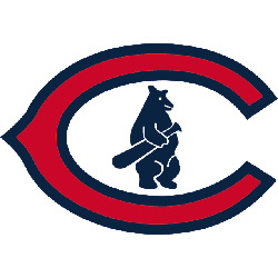
Chicago Cubs
1927 - 1937
In 1927 the Cubs added a blue cub image from the 1911 logo to the classic wishbone "C." The wishbone "C" is red with a thick blue trim. The letter "C" represents the city of Chicago.
Chicago Cubs
1919 - 1927
Back to a red with blue trim wishbone "C" and blue wordmark "UBS" inside the wishbone.

Chicago Cubs
1918 - 1919
The 1918 logo featured a tan, rectangular "C" with blue trim; "UBS" is written inside in blue.

Chicago Cubs
1917 - 1918
Chicago's first wordmark only "CHICAGO" arched and "CUBS" in blue.

Chicago Cubs
1916 - 1917
In 1916, the Cubs redesigned the logo with a new cub design and in a blue with a red border. The "C" changed as well to a wishbone style "C" with a red and blue border. The letter "C" represents the city of Chicago.

Chicago Cubs
1911 - 1916
In 1911 the logo changed to an all blue logo. The cub is now blue just like the "C." The letter "C" represents the city of Chicago.

Chicago Cubs
1908 - 1911
Chicago's first logo with a bear, features a navy blue "C" with a brown and beige bear cub holding a baseball bat inside of the "C." The letter "C" represents the city of Chicago.

Chicago Cubs
1907 - 1908
Another version of an old english letter "C" in brown. The letter "C" represents the city of Chicago.

Chicago Cubs
1906 - 1907
Next logo for the Cubs is a letter block "C" in brown. The letter "C" represents the city of Chicago.

Chicago Cubs
1903 - 1906
The Cubs changed the logo to a different old english letter "C" in blue. The letter "C" represents the city of Chicago.

Chicago Orphans
1898 - 1902
The Orphans logo is an old english letter “C” in blue. The letter “C” represents the city of Chicago.
Unveiling Chicago Cubs Logo History | Explore the Evolution of the Iconic Emblem
Welcome to our insightful journey into the captivating history of the Chicago Cubs logo. In this video, we delve deep into the evolution of one of baseball's most iconic symbols, tracing its origins and significant transformations over the years.
Join us as we uncover the fascinating narrative behind the Chicago Cubs logo, from its humble beginnings to its current emblematic status. Discover the intricate design choices, historical contexts, and memorable milestones that have shaped this emblem throughout the team's rich history.
The Timeless Chicago Cubs Logo
The Chicago Cubs primary logo shines in MLB games, tying fans to Wrigley’s legacy. Rooted in Chicago Cubs logo history, the vintage Chicago Cubs logo inspires nostalgia. Meanwhile, the Chicago Cubs logo bear adds a playful touch. Visit the official Chicago Cubs MLB page for details on the team’s historic moments, roster, and current season.
Baseball Sports Fan Products