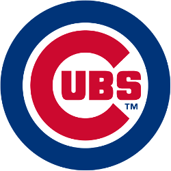
Chicago Cubs
The giant “C” has become rounder inside the blue circle and more geometric while the outlines are thicker. The giant “C” has the “UBS” added inside the “C.” The blue circle has now become much thicker and bold.
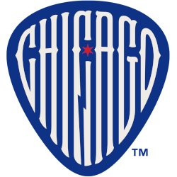
Chicago Cubs
2025 - Present
A custom font wordmark "CHICAGO" in white with a six-pointed red star all placed within a guitar pick in blue.
A tribute to the Chicago Blues genre of music.
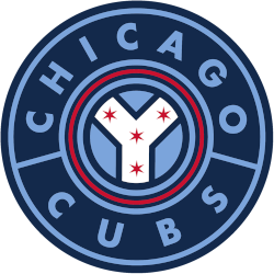
Chicago Cubs
2021 - Present
The Chicago device symbol, rivers converging with red six-pointed stars within a series of red, light blue, and navy blue circles, and a wordmark ""CHICAGO CUBS" encircled around in light blue.
The Chicago Cubs Wrigleyville City Connect.
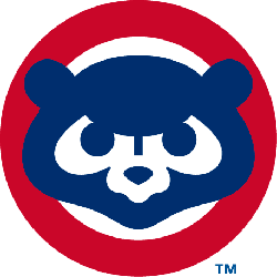
Chicago Cubs
1997 - Present
Angry blue cub walking inside of red letter "C." The letter "C" represents the city of Chicago.

Chicago Cubs
1994 - 1996
A blue cub head facing straight on in a red circle.

Chicago Cubs
1979 - 1993
A cutie blue cub head facing straight on in a red circle.
Chicago Cubs
1972 - 1978
A blue cub head with a yellow face, worn on the Chicago Cubs home and road jersey sleeves from 1978.

Chicago Cubs
1962 - 1971
A navy blue bear cub head with yellow face and rounded ears. Worn on sleeve of Chicago Cubs jerseys from 1962 - 1971. Altered slightly for 1972 season to make ears less rounded.

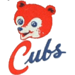
Chicago Cubs
1949 - 1961
ARed cub head over scripted "Cubs" with the letter "C" in red and "ubs" in blue.
Chicago Cubs
1950 - 1956
A brown bear cub head.

Chicago Cubs
1950 - 1956
A brown and black bear cub head within a yellow shield.

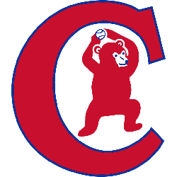
Chicago Cubs
1934 - 1937
A red bear cub standing and holding a blue baseball above its head inside of a red and blue border letter "C." Worn on Chicago Cubs alternate home jerseys from 1934 - 1937. The letter "C" represents the city of Chicago.
Chicago Cubs
1909 - 1910
Large navy blue letter "C" with "UBS" written inside of it, worn on the Chicago Cubs road uniform from 1909 - 1910.

Unveiling Chicago Cubs Logo History | Explore the Evolution of the Iconic Emblem
Welcome to our insightful journey into the captivating history of the Chicago Cubs logo. In this video, we delve deep into the evolution of one of baseball's most iconic symbols, tracing its origins and significant transformations over the years.
Join us as we uncover the fascinating narrative behind the Chicago Cubs logo, from its humble beginnings to its current emblematic status. Discover the intricate design choices, historical contexts, and memorable milestones that have shaped this emblem throughout the team's rich history.
The Iconic Chicago Cubs Logo
Alternate Chicago Cubs logos energize MLB games with team flair. Rooted in Chicago Cubs logo history, the vintage Chicago Cubs logo and Chicago Cubs logo bear evoke nostalgia. Furthermore, these designs captivate collectors. Visit the official Chicago Cubs MLB page. Discover the team’s legacy and updates. Consequently, fans embrace Cubs tradition.