Boston Red Sox
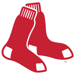
The Boston Red Sox logo comprises of a pair of hanging socks visually representing the team’s name, which derives from the ancient plural form of the word “socks”. All wordmark have been removed.
Boston Red Sox
1976 - 2009
The “Circle Sox” logo which was recently introduced in 1976 is a pair of red socks on a baseball in a circle with the wordmark "BOSTON" in blue with red outline. And the wordmark "RED SOX" in red with a blue outline.

Boston Red Sox
1970 - 1976
Slight changes in the logo and colors. The stitches have changed direction on both side of the ball.
Boston Red Sox
1961 - 1970
Two hanging red socks inside a white baseball with red stitching and navy blue seams and outline.
Boston Red Sox
1924 - 1961
In 1924 the Red Sox went to two red stockings with a little more definition.
Boston Red Sox
1912 - 1924
In 1912, the Red Sox changed to a wordmark "RED SOX" in red.
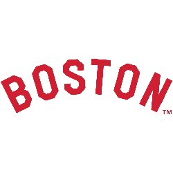
Boston Red Sox
1909 - 1912
In 1909, the Red Sox went to a wordmark "BOSTON" in red.
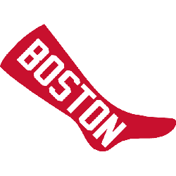
Boston Red Sox
1908 - 1909
This first logo of the Red Sox was a single red stocking with the wordmark "BOSTON" in white.

Boston Americans
1901 - 1907
The Americans logo was a simple old english lettering of "BA" in blue.
Boston Red Sox Logo History: From the Past to the Present!
In this video, we take a journey through the history of the Boston Red Sox logo, exploring how it has evolved over the decades. From its early days to its current design, the logo has undergone several transformations, each reflecting a chapter in the team’s storied legacy. Whether you're a die-hard Sox fan or a lover of sports history, this exploration of the Red Sox logo offers insights into one of the most recognizable symbols in baseball.
The Iconic Boston Red Sox Logo
In Boston Red Sox MLB games, the primary logo shines as a symbol of resilience. Its bold look, tied to Boston Red Sox logo history, inspires fans. Moreover, the Boston Red Sox logo PNG is perfect for collectors. Visit the official Boston Red Sox MLB page to discover the team’s legacy and latest updates.
Soccer Sports Fan Products
