The Montreal Expos alternate logo collection celebrates the team’s unique MLB legacy. Featuring bold fleur-de-lis designs, the Montreal Expos logo ignites team spirit. This collection highlights Montreal Expos logo history, uniting fans with the vibrant heritage of Montreal Expos baseball.
Montreal Expos
1992 - 2004
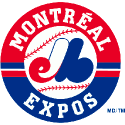
The “eMb” or “M” logo in red, white and blue on top of a white with red seams baseball inside a red and blue ring with a wordmark “MONTREAL EXPOS” in white lettering.
Montreal Expos
1969 - 2004
Interwoven script pieces all come together to abbreviate the full name of the team. "eMb" in red white and blue forming a "M." The letter "M" stands for the city of Montreal.

The Distinctive Montreal Expos Logo
A bold fleur-de-lis design shapes the Montreal Expos logo in this nostalgic collection. Montreal Expos logo history blends vibrant styles with Canadian charm. Fans love Montreal Expos MLB designs for their retro appeal. Additionally, check the Montreal Expos Primary Logo. It offers unique designs for collectors. These logos spark fan enthusiasm, reflecting the team’s memorable legacy daily.
Alternate Montreal Expos logos energize baseball games with cultural flair. Rooted in Montreal Expos logo history, the Montreal Expos MLB logo evokes passion. Furthermore, Montreal Expos baseball designs captivate collectors with sharp detail. Visit the official Montreal Expos Wikipedia page. Discover the franchise’s legacy. Consequently, fans embrace Montreal Expos baseball heritage with spirited enthusiasm.