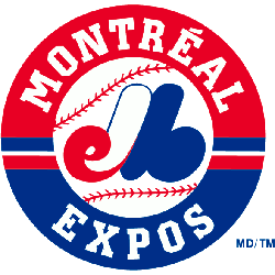
The Montreal Expos primary logo captures the team’s unique MLB legacy. Featuring a stylized “M” with red, white, and blue, the Montreal Expos logo embodies team spirit. This collection of primary logos showcases Montreal Expos baseball history, uniting fans with the franchise’s vibrant tradition.
Montreal Expos
1992 - 2004
The “eMb” or “M” logo is in red, white, and blue on top of a white with red seams baseball inside a red and blue ring with a wordmark “MONTREAL EXPOS” in white lettering.
Montreal Expos
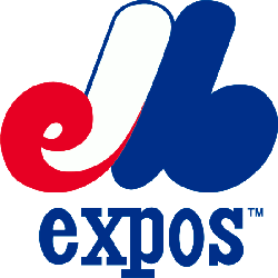
1969 - 1992
For almost 40 years the team held on to this awesome logo because it was smart and looked great from Expos de Montreal Baseball. Interwoven script pieces all come together to abbreviate the full name of the team. "eMb" in red white and blue forming a "M." A wordmark "expos" in blue at the bottom.
The Distinctive Montreal Expos Logo
A stylized “M” defines the Montreal Expos logo, blending red, white, and blue. Its Montreal Expos logo history reflects the Montreal Expos baseball identity. Fans cherish its bold design. Additionally, check the Montreal Expos alternate logo. It highlights more styles in this iconic Montreal Expos MLB collection.
The Montreal Expos logo energized Montreal Expos baseball games. Rooted in Montreal Expos logo history, its design captivates Montreal Expos MLB fans. Furthermore, the logo’s vibrant style inspires collectors. Visit the official Washington Nationals MLB page. Discover the franchise’s legacy and updates. Consequently, fans embrace Expos tradition.