The Tampa Bay Rays alternate logo collection showcases the team’s vibrant MLB legacy. Featuring bold sunburst and “TB” designs, the Tampa Bay Rays logo boosts team spirit. This collection highlights Rays logo history, uniting fans with the dynamic tradition of Tampa Bay’s baseball franchise.
Tampa Bay Rays
2019 - Present
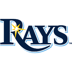
Wordmark “RAYS” in navy blue with a light blue drop shadow and a glint of sun ray in gold.
Tampa Bay Rays
2008 - Present
The yellow sunburst taken off the primary logo. The sunburst has been enlarged from the primary logo.

Tampa Bay Rays
2008 - Present
A navy blue, yellow and light blue sting ray swimming to the right.

Is the NEW Tampa Bay Rays Logo BETTER Than the Original?
This video takes you from the early days of the Devil Rays to the current Rays logo, exploring the reasons behind each transformation and what these changes signify for the team and its fans. Whether you're a long-time supporter or just curious about sports branding, this deep dive into the Tampa Bay Rays logo history will give you a new appreciation for the iconic symbols that represent this dynamic team.
The Vibrant Tampa Bay Rays Logo
A bold sunburst and “TB” shape the Tampa Bay Rays logo in this alternate collection. Rays logo history traces the old Rays logo and new Rays logo designs. Fans love their coastal style. Additionally, check the Tampa Bay Rays wordmark logo. It offers more designs for collectors and enthusiasts to enjoy.
Alternate Rays logos energize baseball games with flair, reflecting team heritage. Rooted in Rays logo history, the old Tampa Bay Rays logo sparks nostalgia, while the new Tampa Bay Rays logo shines. Furthermore, these designs captivate collectors. Visit the official Tampa Bay Rays website. Discover the franchise’s legacy. Consequently, fans embrace the Rays’ enduring tradition.
Baseball Sports Fan Products