Pittsburgh Pirates
The Pirates chose to use a old english letter “P” in yellow, going back to the old style of logo from the early 1900’s. The letter “P” stands for either the city Pittsburgh or the nickname Pirates.
Pittsburgh Pirates
2011 - Present
Double lined wordmark with "PITTSBURGH" in black on top and "PIRATES" in yellow with white and black highlights. The wordmark "PIRATES" is arched.
Font: MLB PIRATES FONT
https://www.ffonts.net/MLB-Pirates.font
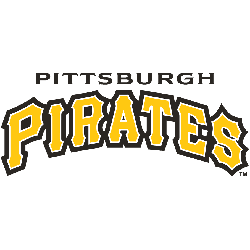
Pittsburgh Pirates
2011 - Present
Double lined wordmark with "PITTSBURGH" in black on top and "PIRATES" in yellow with white and black highlights. The wordmark "PIRATES" is arched.
Font: MLB PIRATES FONT
https://www.ffonts.net/MLB-Pirates.font
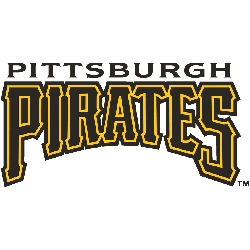
Pittsburgh Pirates
1997 - 2010
Double lined wordmark with "PITTSBURGH" in black on top and "PIRATES" in black with yellow highlights and arched bottom of the font.
Font: MLB PIRATES FONT
https://www.ffonts.net/MLB-Pirates.font
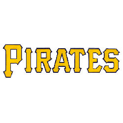
Pittsburgh Pirates
1960 - 1996
Single lined wordmark "PIRATES" in yellow with a black outline.
Font: MLB PIRATES FONT
https://www.ffonts.net/MLB-Pirates.font
The 100-Year Evolution of the Pittsburgh Pirates Logo Revealed!
Dive into the captivating world of the Pittsburgh Pirates logo evolution in this video by the Sports History Group. Join us as we explore the legendary journey behind the iconic symbol representing one of Major League Baseball's most storied franchises. From its inception to the modern-day design, we'll uncover the fascinating history of the Pittsburgh Pirates logo, highlighting its significant changes and transformations over the years...
The Bold Pittsburgh Pirates Logo
Pittsburgh Pirates wordmark logos energize baseball games with timeless flair. Drawing from Pittsburgh Pirates logo history, old Pittsburgh Pirates logo designs evoke passion among supporters. Furthermore, logo PNG artwork captivates collectors with sharp detail. Visit the official Pittsburgh Pirates Wikipedia page. Consequently, fans embrace Pittsburgh Pirates baseball heritage, celebrating the team’s bold wordmark identity with spirited enthusiasm.
Baseball Sports Fan Products