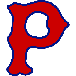
Pittsburgh Pirates
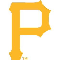
The Pirates chose to use a old english letter “P” in yellow, going back to the old style of logo from the early 1900’s. The letter “P” stands for either the city Pittsburgh or the nickname Pirates.
Pirates Primary Logo
The Pittsburgh Pirates are one of the oldest and most beloved professional baseball teams in America. Established in 1887, they have been part of Major League Baseball since their inception. Throughout the years, they have had a number of primary logos that reflect their heritage and identity as iconic franchises.
Throughout all these changes, one thing remains constant: The Pittsburgh Pirates’ primary logo is still instantly recognizable even after 130 years! From classic designs to modern updates, it continues to be synonymous with excellence within Major League Baseball while simultaneously paying homage to its rich history throughout generations past present, and future alike. With such strong brand recognition, there's no doubt that this iconic symbol will continue representing “the Bucs” for many more decades ahead!
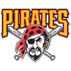
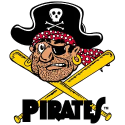
Pittsburgh Pirates
1997 - 2015
In 1997 with yet another new pirate, described as a “modernized buccaneer.” The new logo featured a front view of a pirates face with red and black poke-a-dot bandana with black patch and a gold erring. Two white and black baseball bats are crossed behind the pirate. A wordmark "PIRATES" above the pirate in gold with orange and black trim.
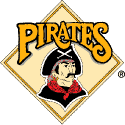
Pittsburgh Pirates
1987 - 1997
In 1987 the Pirates brand needed to be refresh, the team’s centennial season resulted in a new logo that brought back a pirate logo from 1936, mounted on a yellow baseball diamond. A wordmark "PIRATES" in yellow with a black trim.
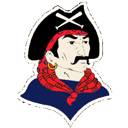
Pittsburgh Pirates
1967 - 1987
This buccaneer was illustrated by artist Bob Gessner, who was also responsible for the NHL Pittsburgh Penguins’ skating penguin logo. This newer, friendlier pirate has a black hat and black scarf mounted on a square yellow background. A wordmark "PIRATES" in black at the bottom.
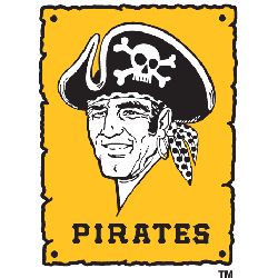
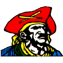
Pittsburgh Pirates
1960 - 1967
In 1958, the Pirates formally replaced their logo with a cartoon image of a stubbled buccaneer wearing a black hat with a red scarf with white dots, black patch and two gold erring. Below the pirate is two gold baseball bats crossed with a wordmark "PIRATES" in black. This logo was drawn by longtime Pittsburgh Press artist Jack Berger, Sr.
Pittsburgh Pirates
1948 - 1960
New artist rendition of a pirate, featuring a red hat with two yellow baseball bats crossed. The pirate has a blue shirt with a yellow scarf.
Pittsburgh Pirates
1936 - 1948
The first logo that is not a letter. The first real Pirate logo has a pirate with a black hat with two baseball bats crossed. The pirate has a blue shirt and a red scarf, who has a mustache and a gold erring.
Pittsburgh Pirates
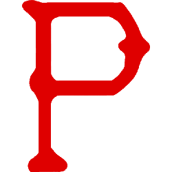
1933 - 1936
A new design for the Pirates letter "P" in red with a blue trim. The letter "P" stands for either the city Pittsburgh or the nickname Pirates.

Pittsburgh Pirates
1932 - 1933
Third time using this block style letter "P" in blue. The letter "P" stands for either the city Pittsburgh or the nickname Pirates.

Pittsburgh Pirates
1923 - 1932
New style of the letter "P" in blue. The letter "P" stands for either the city Pittsburgh or the nickname Pirates.

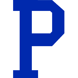
Pittsburgh Pirates
1922 - 1923
Changed to an old english style letter "P" in blue. The letter "P" stands for either the city Pittsburgh or the nickname Pirates.

Pittsburgh Pirates
1921 - 1922
Back to blue block letter "P." The letter "P" stands for either the city Pittsburgh or the nickname Pirates.

Pittsburgh Pirates
1920 - 1921
Back to the letter block style from 1910, however now in red. The letter "P" stands for either the city Pittsburgh or the nickname Pirates.
Pittsburgh Pirates
1915 - 1920
The Pirates change the font to a font that is similar to Bruce Double Pica letter "P" in red. The letter "P" stands for either the city Pittsburgh or the nickname Pirates.
Pittsburgh Pirates
1910 - 1915
The Pirates changed back to a single block letter "P" in navy blue. The letter "P" stands for either the city Pittsburgh or the nickname Pirates.
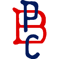
Pittsburgh Pirates
1908 - 1910
The Pirates changed to a three letter logo in 1908. They used a block letter "B" in red and "P" on top in blue and "C" on the bottom in blue as well. A "PBC" monogram signifying "Pittsburgh Baseball Club."
Pittsburgh Pirates
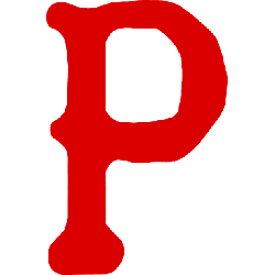
1907 - 1908
Changed the letter logo to an old english letter "P" in red. The letter "P" stands for either the city Pittsburgh or the nickname Pirates.

Pittsburgh Pirates
1900 - 1907
The first Pirate logo is a block letter "P" in blue. The letter "P" stands for either the city Pittsburgh or the nickname Pirates.


Time to Vote Pirates Fans
Click to go to MLB Logo Battle and vote
Pittsburgh Pirates Logo History: Evolution of an Icon!
It is a riveting exploration of the Pittsburgh Pirates' logo transformations since their establishment in 1881. The logo's journey, beginning as a simple yet captivating 'P' and progressing to the emblematic pirate symbol with crossed baseball bats, mirrors the team's evolution and the changing times. The logo has embraced the team's spirit and the city's culture with various redesigns, including a stylized pirate figure and a pirate ship. The shift in team colors from the original blue and red to the now signature black and gold further aligns the Pirates with Pittsburgh's other professional sports teams. Despite the changes, the Pirates' logo remains a potent symbol of the team's rich heritage and passion for baseball in Pittsburgh.