Milwaukee Brewers
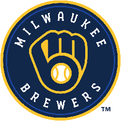
An “M” and a “B” in the shape of a baseball glove in navy, royal blue, and yellow inside a circle with wordmark “MILWAUKEE BREWERS” in white written around it.
Milwaukee Brewers
2018 - 2020
A blue with white and gold trim letter "M" with wheat below in gold and blue.
Milwaukee Brewers
2000 - 2018
The 2000 logo, has a wordmark "MILWAUKEE" on top in gold and a scripted wordmark "Brewers" in a blue with white and gold trim on top of a white with red seam baseball. The new logo also features a nod to the team's roots, with a sprig of barley representing Milwaukee's brewery tradition.
Milwaukee Brewers
1998 - 2000
Interlocking initials "MB" in gold with green and white outlines on a blue, gold and white diamond with crossed green bats.

Milwaukee Brewers
1994 - 1998
In 1998, the Brewers unveiled their first new logo and team colors since the 1978 season. The development of the new logo began in November 1992 when the Brewers approached Major League Baseball Properties Design Services about creating a "new look" as the Brewers approached the 21st century. The finished product, which took the field for opening day 1994, incorporated the letters "m" and "b" over crossed baseball bats and a background representing a blue with gold trim baseball diamond.
Milwaukee Brewers
1978 - 1994
The logo was selected among more than 2,000 entries from both professional and amateur designers in an open contest in November 1977. Tom Meindel, an Art History student at the University of Wisconsin-Eau Claire, designed the logo and earned the $2,000 first prize. The logo combines the lower case letters "m" and "b", the club's initials, to form a baseball glove with a baseball in the center.
Milwaukee Brewers
1970 - 1978
The Brewers first logo is a baseball player swinging a bat inside a yellow circle. A wordmark above the baseball player "MILWAUKEE" and below the baseball player "BREWERS."

Seattle Pilots
1968 - 1969
The Pilots only logo is symbolized by a pair of pilots wings flanking a ship captain's wheel with a white baseball and red seams hub bearing the wordmark "pilots" located in the center of the baseball. The emblem is tri-color in design with a gold wings, red wheel, blue letters and blue outline.
The Classic Milwaukee Brewers Logo
The Milwaukee Brewers logo shines in MLB games. Rooted in Milwaukee Brewers logo history, it honors the old Milwaukee Brewers logo. Furthermore, the new Milwaukee Brewers logo inspires fans. Visit the official Milwaukee Brewers MLB page. Discover the team’s legacy, roster, and updates. Consequently, fans connect with the Brewers’ spirit.
Baseball Sports Fan Products
