
Los Angeles Angels
A two-toned letter “A” trimmed in blue with a silver halo. A new logo due to changes of dropping “of Anaheim” prior to the 2016 season.

Anaheim Angels
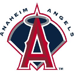
2005 - 2016
A two-toned letter "A" trimmed in blue with a silver halo.
Anaheim Angels
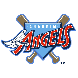
2002 - 2004
Disney changed the Angels's logo back to a "Big A" in red with white trim and a silver halo, over a dark blue baseball diamond with white, silver and red trim. On top arching over the diamond is the wordmark "ANAHEIM ANGELS."
Anaheim Angels
1997 - 2002
The first logo under Disney removed the halo and had a rather cartoon like "ANGELS" script with a wing on the "A" over a periwinkle plate and crossed bats. Also, a wordmark "ANAHEIM" in white on top. This logo comes right from the Disney movie "Angels in the Outfield."
California Angels
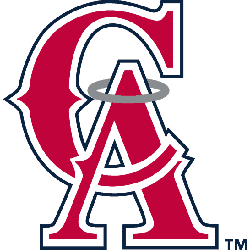
1995 - 1996
The blue circle with silver trim was removed and the interlocking "CA" was enlarged. The "CA" is red with a white and blue outline.
California Angels
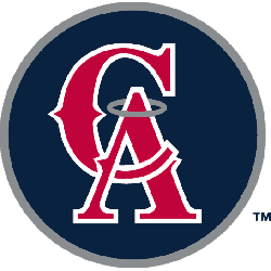
1993 - 1995
After the "Big A" was removed from the parking lot in 1992, the Angels returned to their roots and re-adopted the interlocking "CA" logo with some differences. The Angels used the "CA" on against the traditional blue background circle with silver outline. The "A" has a silver halo on top. Designed with Major League Baseball Properties, the logo is similar to one the Angels had from 1965 - 1970.
California Angels
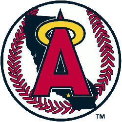
1986 - 1993
In 1986, the Angels adopted the "Big A" a red letter with blue trim and a yellow halo around the "A." The "A" is on top of a white baseball with red seams and a blue shadow of California in the background. A yellow star indicating the location of Anaheim.
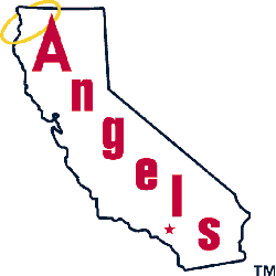
California Angels
1973 - 1986
In 1973 the Angels did some slight changes to the logo from 1971. The "A" in the scripted wordmark "angels" was lower-case and was changed to an upper case "Angels." The star that indicated the location of Anaheim is now red and not yellow.
California Angels
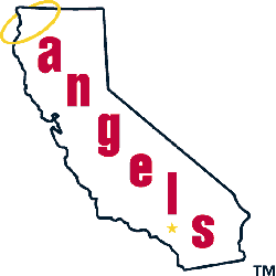
1971 - 1973
In 1971, the Angels adopted a logo that had the wordmark "angels" written diagonally on an outline of the State of California. A yellow halo hung around the top right corner of the state and a yellow star indicated the city of Anaheim.

California Angels
1965 - 1971
The first California Angels logo was very similar to the previous "LA" logo. The only difference was instead of an interlocking "LA" letters, there was an interlocking "CA" letters.
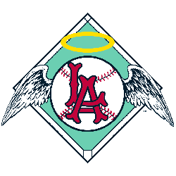
Los Angeles Angels
1961 - 1964
The Angels first logo depict a white with red seams baseball with wings and a halo over a light green baseball diamond with letter link "L" and "A" over it.
Exploring Los Angeles Angels Logo History: Secrets You Didn't Know!
Delve into the evolution of the Los Angeles Angels Logo History! From its humble beginnings to its modern-day representation, this video unveils the intriguing journey behind one of baseball's iconic logos. Explore the hidden stories and secrets that shaped the logo's design over the years. Join us on this immersive adventure through time and design. Don't miss out on uncovering the fascinating Los Angeles Angels Logo History!
The Radiant Los Angeles Angels Logo
The Los Angeles Angels logo shines in Los Angeles Angels baseball games. Rooted in Los Angeles Angels logo history, it inspires fans. Additionally, Los Angeles Angels logo PNG files delight collectors. Visit the official Los Angeles Angels MLB page. Learn about the team’s storied past, roster, and season updates.