Kansas City Athletics
1955 - 1967
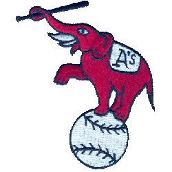
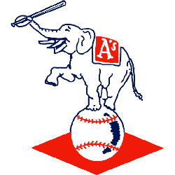
A white with blue trim elephant standing on a white baseball holding a baseball bat with its trunk, a orange banner reading "A's" in white on its back. The letter "A" stands for the team nickname Athletics.
Athletics Alternate Logo
The Kansas City Athletics alternate logo history is a fascinating story of the team’s evolution over time. The original design was created in 1955 when the franchise moved from Philadelphia to Kansas City, and it featured an A with a baseball inside of it. This logo remained until 1961 when they changed their name to the Oakland Athletics and adopted a new look that included three white stripes running down either side of an interlocking “KC” symbol. In 1968, they returned to their original name and adopted yet another new look featuring two crossed bats behind an elephant head wearing sunglasses—an homage to owner Charles O Finley's love for elephants.
The most recent iteration of this alternate logo first appeared in 1981 as part of Major League Baseball's expansion into Canada, which saw teams like the Toronto Blue Jays come into existence. This version features two intertwined Ks with red stars on either side—representing both cities where teams were based (Kansas City & Toronto). It has become one staple among fans since then due to its unique style and connection between two different cities across North America that share similar histories within professional sports leagues such as MLB or NHL hockey leagues today!
Overall, while some may not be familiar with all aspects surrounding this particular topic; there are many interesting details about how these logos have evolved over time that can provide insight into how sports franchises adopt branding strategies according to changing times or environments around them! From its inception back in 1955 all way up until the present day; each redesign has brought something fresh & exciting for fans alike no matter what city you call home - making sure everyone knows exactly who is playing ball under one unified banner: The Kansas City Athletics!
Kansas City Athletics
1963 - 1967
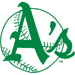
The letter "A's" in green on white with green outlined baseball as background.
Kansas City Athletics
1963 - 1967
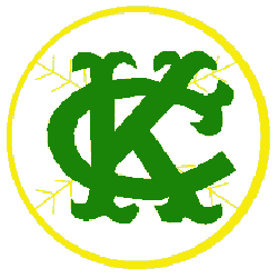
The Athletics changed the logo in 1963 to a white baseball with yellow trim. On top of the baseball is an interlocking old english lettering "KC" in green.
Kansas City Athletics
1955 - 1962
In Kansas City, the logo stayed the same concept but a new artist rendering. The red elephant is again standing on a baseball with three legs and holding a bat. On the elephants back is "A's" now in a light blue.