The Colorado Rockies alternate logo collection showcases the team’s bold MLB legacy. Featuring rugged mountain and baseball designs, the Colorado Rockies logo enhances team spirit. This collection highlights Colorado Rockies logo history, uniting fans with the vibrant tradition of Colorado Rockies MLB.

Colorado Rockies
2017 - Present
A classic letter linked “CR” in silver with a thick black trim. The letter “CR” represent the state and nickname Colorado Rockies.
Colorado Rockies
2017 - Present
Black and white baseball going past the purple mountain rockies, with a black arch on top and the silver wordmark “COLORADO” inside. On the bottom is the wordmark “ROCKIES” in silver with a black outline framed with two different lengths of a black line.
Former primary logo.
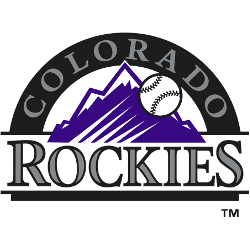
Colorado Rockies
1993 - 2016
This alternative logo is a classic letter linked "CR" in silver with a black thick trim. The letter "CR" represent the state and nickname Colorado Rockies.
Moved to primary logo.

The Bold Colorado Rockies Logo
Rugged mountains and a baseball define the Colorado Rockies logo in this alternate collection. Colorado Rockies logo history traces dynamic Colorado Rockies MLB designs. Fans love Colorado Rockies logo PNG downloads. Additionally, check the Colorado Rockies wordmark logo. It showcases more styles in this vibrant collection.
Alternate Rockies logos energize Colorado Rockies MLB games. Rooted in Colorado logo history, these designs boost team passion. Furthermore, Colorado Rockies logo PNG files captivate collectors. Visit the official Colorado Rockies MLB page. Discover the team’s legacy and updates. Consequently, fans embrace Rockies tradition.

