The Colorado Rockies primary logo captures the team’s rugged MLB spirit. With its bold mountain design, the Colorado Rockies logo reflects Denver’s pride. This collection of primary logos unites fans, showcasing the Colorado Rockies MLB legacy at Coors Field.

Colorado Rockies
2017 - Present
A classic letter linked “CR” in silver with a thick black trim. The letter “CR” represent the state and nickname Colorado Rockies.
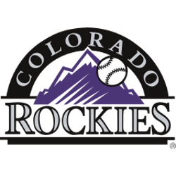
Colorado Rockies
1993 - 2017
The Colorado Rockies logo design is a black and white baseball going past the purple mountain rockies, with a black arch on top and the silver wordmark "COLORADO" inside. On the bottom is the wordmark "ROCKIES" in silver with a black outline framed with two different lengths of a black line.
The Rugged Colorado Rockies Logo
The Colorado Rockies logo, featuring a striking mountain, embodies the team’s grit. Its Colorado Rockies logo history highlights bold designs, ideal for Colorado Rockies logo PNG downloads. Additionally, it defines the franchise’s identity. Check out the Colorado Rockies alternate logo for more designs in this dynamic collection.
In Colorado Rockies MLB games, the primary logo stands for resilience. Tied to Colorado Rockies logo history, its vivid design shines in Colorado Rockies logo PNG files. Moreover, it inspires fans at Coors Field. Visit the Colorado Rockies MLB page to learn about the team’s legacy, roster, and latest season updates.
Baseball Sports Fan Products

Time to Vote Rockies Fans
Plunge into the thrilling universe of the MLB Team Logo Battle, where the Colorado Rockies logo, a symbol of our towering ambition and unwavering spirit, locks horns with the emblems of rival teams. Our logo, with its majestic purple mountain range and crisp baseball, is more than just an emblem; it's a testament to our team's grit and high-reaching determination. This design, deeply rooted in the spirit of our breathtaking landscape, encapsulates the essence of Colorado - majestic, committed, and filled with passionate commitment. As Rockies fans, we wear this emblem with mountainous pride, symbolizing our steadfast loyalty. Join us in this exhilarating contest as our logo battles for supremacy, embodying the indomitable spirit of the Colorado Rockies and their devoted fans. Let's prove that our logo doesn't merely stand out; it stands tall as a testament to our lofty ambitions and undying pride!

