The Boston Doves primary logo captures the team’s unique MLB history. Featuring a sleek dove and “B,” the Boston Doves logo reflects pride. This collection of primary logos highlights the Boston Braves logos, uniting fans with the team’s legacy from 1907 to 1910.
Boston Doves
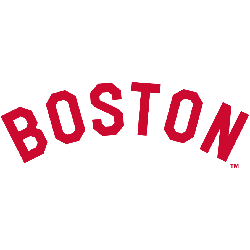
1910 - 1911
For the first time with only a wordmark "BOSTON" in the color red.

Boston Doves
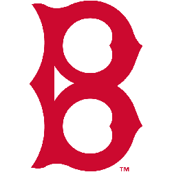
1909 - 1910
Red bold letter "B" in a black circle looking like a baseball. The letter "B" stands for the city of Boston.
Boston Doves
1908 - 1909
The letter "B" changed to an old style "B" continuing in red. The letter "B" stands for the city of Boston.
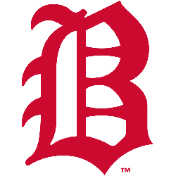
Boston Doves
1907 - 1908
The Doves first logo was the old English letter "B" in red. The letter "B" stands for the city of Boston.
The Classic Boston Doves Logo
A graceful dove and “B” define the Boston Doves logo. Its history, tied to Boston Braves logos, includes the 1909 Boston Doves emblem. Fans admire its vintage style, unlike the Boston Braves logo 1935. Additionally, check the Atlanta Braves primary logo. It showcases more designs in this collection.
The Boston Doves logo energized games from 1907 to 1910. Rooted in Boston Braves logos history, the 1909 Boston Doves design sparks nostalgia. Furthermore, it differs from the Boston Braves logo 1935. Visit the official Atlanta Braves MLB page. Discover the team’s legacy and updates. Consequently, fans connect with Doves pride.