Boston Braves
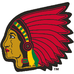
1945 - 1952
The native American has returned will color. Now the Native American has brown skin color with black hair. The headdress is now red and features a green and orange headband.
Boston Braves
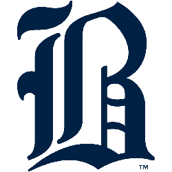
1941 - 1945
The Braves continued with the old english letter "B" again in a dark blue. The letter "B" stands for the city of Boston.
Boston Braves
1929 - 1935
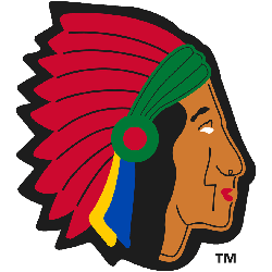
The native American has returned will color. Now the Native American has brown skin color with black hair. The headdress is now red features with a green and orange headband.
Boston Braves
1925 - 1929
A different variation of the old style letter "B" in a little blue. The letter "B" stands for the city of Boston.
Boston Braves
1921 - 1925
The Braves went back to the old style letter "B" in blue. The letter "B" stands for the city of Boston.
Boston Braves
1916 - 1921
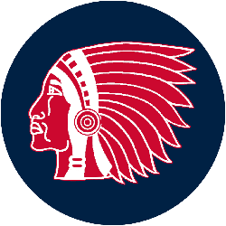
A blue background circle added to the red Native American.
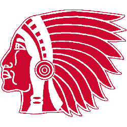
Boston Braves
1912 - 1916
From 1912 to 1956 the Braves on and off logo was a red Native American with a headdress.
The Historic Boston Braves Logo
The Boston Braves logo energized MLB games from 1912 to 1952. Rooted in Boston Braves logo history, the Boston Braves logo 1935 inspires nostalgia. Furthermore, Braves logos history connects fans to the past. Visit the official Atlanta Braves MLB page. Discover the team’s legacy and updates. Consequently, fans feel Braves pride.


