The Anaheim Angels primary logo embodies the team’s vibrant MLB legacy. Featuring a haloed “A,” the Anaheim Angels logo radiates pride. This collection of primary logos highlights the Anaheim Angels baseball heritage, uniting fans with the team’s dynamic history and enduring spirit.
Anaheim Angels
2002 - 2004
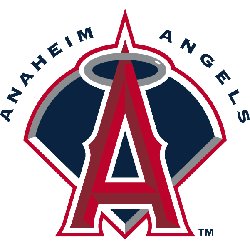
Disney changed the Angels's logo back to a "Big A" in red with white trim and a silver halo over a dark blue baseball diamond with white, silver, and red trim. On top arching over the diamond is the wordmark "ANAHEIM ANGELS."
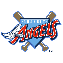
Anaheim Angels
1997 - 2002
The first logo under Disney removed the halo and had a rather cartoon like "ANGELS" script with a wing on the "A" over a periwinkle plate and crossed bats. Also, a wordmark "ANAHEIM" in white on top. This logo comes right from the Disney movie "Angels in the Outfield."
The Radiant Anaheim Angels Logo
A haloed “A” defines the Anaheim Angels logo, symbolizing team spirit. Its Anaheim Angels logo history showcases bold Anaheim Angels baseball designs. Fans cherish Anaheim Angels logo PNG downloads for their charm. Additionally, check the Anaheim Angels alternate logo. It reveals more styles in this vibrant collection. Consequently, fans celebrate the team’s legacy.
The Anaheim Angels logo energizes Anaheim Angels baseball games. Rooted in Anaheim Angels logo history, it inspires fan pride. Furthermore, Anaheim Angels logo PNG files thrill collectors. Visit the official Los Angeles Angels MLB page. Discover the team’s legacy and updates. Therefore, fans connect with Angels pride.

