The Baltimore Orioles (1901-1902) primary logo captures the team’s early MLB legacy. Featuring a bold design, the Baltimore Orioles logo reflects team spirit. This collection of primary logos showcases the Baltimore Orioles logo history, uniting fans with the franchise’s heritage as the New York Yankees’ original name.
Baltimore Orioles
1901 - 1902
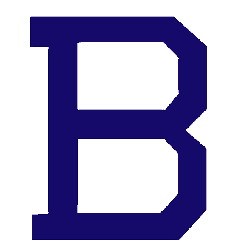
The final logo was a change in letters from "O" to a blue block letter "B." The letter "B" stands for the city of Baltimore.

Baltimore Orioles
1900 - 1901
The Orioles original logo is a orange block letter "O" with a black inside color. The letter "O" stands for the team nickname Orioles.
The Historic Baltimore Orioles Logo
A bold design defines the Baltimore Orioles logo from 1901-1902. Its Baltimore Orioles logo history, tied to the old Baltimore Orioles logo, marks the roots of the New York Yankees. Fans cherish its vintage style. Additionally, check the New York Yankees alternate logo. It highlights more designs in this historic collection.
The Baltimore Orioles logo energized MLB games in 1901-1902. Rooted in Baltimore Orioles logo history, the old Baltimore Orioles logo inspires nostalgia for the Yankees’ origins. Furthermore, its design captivates collectors. Visit the official New York Yankees MLB page. Discover the franchise’s legacy and updates. Consequently, fans embrace this early Orioles tradition.
Baseball Sports Fan Products