Athletics
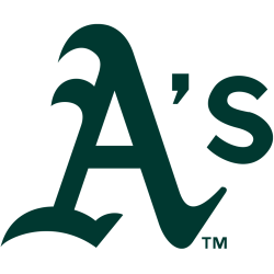
A green letter “A” with an apostrophe “S” that had been used when they played in Oakland for multiple decades. This version of the A was first adopted in 1993, following slight tweaks to logos used as far back as 1902.

Oakland Athletics
1993 - 2025
The current logo is large "A's" in green with gold trim on a white background inside thick green circle with wordmark "OAKLAND ATHLETICS."
Oakland Athletics
1983 - 1993
In 1983 Oakland unveiled a new logo that was a yellow "A's" inside a white background with a thick green border. On top the "A's" is the wordmark "OAKLAND" and on the bottom "ATHLETICS."

Oakland Athletics
1971 - 1983
The next Oakland logo is a kelly green "A's" on bright yellow baseball with a green border and with thick white seams from a baseball. A pair of white sneakers hanging to the left of the "A" and the wordmark "The Swingin' A's" in black and green.
Oakland Athletics
1968 - 1971
The original Oakland logo, is a white baseball with yellow seams and a green outline. A large scripted "A's" in green on top of the baseball.

Kansas City Athletics
1955 - 1967
A white with blue trim elephant standing on a white baseball holding a baseball bat with its trunk, a orange banner reading "A's" in white on its back. The letter "A" stands for the team nickname Athletics.
Philadelphia Athletics
1953 - 1954
The final logo for Philadelphia Athletics is a white with blue outline elephant standing on a baseball with three legs. The elephant is holding a bat in it's trunk. On the elephant's back is "A's" in white on a orange background. The baseball and elephant are on a orange diamond.
Philadelphia Athletics
1939 - 1953
The 1939 logo featured a detailed black line drawing of an white elephant, holding a baseball in it's trunk. With an emblem of "A's" in white with a red background.

Philadelphia Athletics
1930 - 1939
New design of the mascot elephant, now in white with a light blue thick outline. This elephant is on all four legs.

Philadelphia Athletics
1928 - 1930
Back to the old english style letter "A" in light blue with a white and blue outline.

Philadelphia Athletics
1924 - 1928
Another drawing of an elephant, now is white with black trim. Again on his hind legs.

Philadelphia Athletics
1921 - 1924
New artist rendering of the an elephant up on his hind legs. Now in a lighter blue color.

Philadelphia Athletics
1920 - 1921
The 1920 logo featured the first drawing of an elephant as the logo, done in the color dark blue.

Philadelphia Athletics
1902 - 1920
In 1902 the Athletics changed to an old english letter "A" in a dark blue.

Philadelphia Athletics
1901 - 1902
The original Philadelphia logo was a block letter "A" in the color blue.
Oakland Athletics Primary Logo
Our Athletics logo primary collection highlights the 1968 elephant design, a favorite for Oakland Athletics baseball enthusiasts. This Athletics logo marks their nine World Series titles, including the 1970s dynasty. Collectors love it for its historical depth. For alternate designs, see our Oakland Athletics alternate logo. This tribute keeps the Athletics’ Oakland roots alive with pride.
Baseball Sports Fan Products
