California Angels
1995 - 1996
The blue circle with silver trim was removed and the interlocking "CA" was enlarged. The "CA" is red with a white and blue outline.
California Angels
1993 - 1995
After the "Big A" was removed from the parking lot in 1992, the Angels returned to their roots and re-adopted the interlocking "CA" logo with some differences. The Angels used the "CA" on against the traditional blue background circle with silver outline. The "A" has a silver halo on top. Designed with Major League Baseball Properties, the logo is similar to one the Angels had from 1965 - 1970.
California Angels
1986 - 1993
In 1986, the Angels adopted the "Big A" a red letter with blue trim and a yellow halo around the "A." The "A" is on top of a white baseball with red seams and a blue shadow of California in the background. A yellow star indicating the location of Anaheim.
California Angels
1973 - 1986
In 1973 the Angels did some slight changes to the logo from 1971. The "A" in the scripted wordmark "angels" was lower-case and was changed to an upper case "Angels." The star that indicated the location of Anaheim is now red and not yellow.
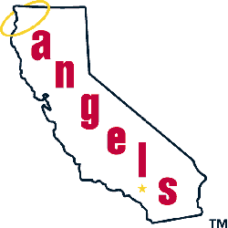
California Angels
1971 - 1973
In 1971, the Angels adopted a logo that had the wordmark "angels" written diagonally on an outline of the State of California. A yellow halo hung around the top right corner of the state and a yellow star indicated the city of Anaheim.

California Angels
1965 - 1971
The first California Angels logo was very similar to the previous "LA" logo. The only difference was instead of an interlocking "LA" letters, there was an interlocking "CA" letters.
The Iconic California Angels Logo
The California Angels logo energizes MLB games with CA Angels logo flair. Rooted in California Angels logo history, the old California Angels logo sparks nostalgia. Furthermore, its design inspires collectors. Visit the official Los Angeles Angels MLB page. Discover the team’s legacy and updates. Therefore, fans connect with Angels pride.
