Brooklyn Robins
1930 - 1931
The Robins changed to a block letter "B" in a powder blue with blue trim.
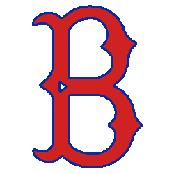
Brooklyn Robins
1929 - 1930
The same style font from the previous year, with only color changes. The "B" is now red with a dark blue trim.
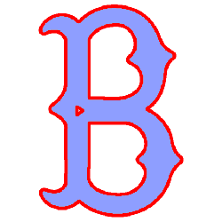
Brooklyn Robins
1928 - 1929
The Dodgers switched to a sky blue and put a red border around the "B."

Brooklyn Robins
1927 - 1928
In 1928, the font that is similar to Bruce Double Pica letter "B" in blue with a red circle around the "B."

Brooklyn Robins
1926 - 1927
This is the same logo used by the Brooklyn Dodgers in 1912.
Brooklyn Robins
1914 - 1926
This is a recall of the same logo that the Superbas used in 1909.
The Iconic Brooklyn Robins Logo
A bold “B” defines the Brooklyn Robins logo, inspired by manager Wilbert Robinson. The Brooklyn Robins history highlights classic Brooklyn Robins hat designs. Fans cherish its vintage style. Additionally, check the Los Angeles Dodgers logo. It reveals more designs in this historic collection. Consequently, fans celebrate the Robins’ legacy.
The Brooklyn Robins logo energized MLB games from its era. Rooted in Brooklyn Robins history, it adorned Brooklyn Robins hats, sparking nostalgia. Furthermore, its design reflects the team’s spirit. Visit the official Los Angeles Dodgers MLB page. Discover the franchise’s legacy and updates. Therefore, fans connect with Robins pride.

