Miami Marlins
2019 - Present
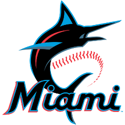
A blue, red, and black marlin leaping next to a baseball and wordmark “Miami” in black with blue and red trim.
Marlins Alternate Logo
The Miami Marlins have had a long and storied history of alternate logos, particularly in relation to the Miami Marlins Wordmark logo. From their original logo, which featured a marlin leaping from the sea with its tail forming an “M” for “Miami,” to their current logo featuring two fish tails curving together in an infinity symbol, the team has undergone several changes over the years. Each of these designs has played an important role in defining what it means to be a fan of this iconic Major League Baseball franchise.
One particularly noteworthy design is that used during the 1997-98 season when they were known as The Florida Marlins. This version featured three orange stars above and below a large letter M representing both Miami and Florida respectively; thus embodying both cities within one mark. It was also unique at this time because most teams only had one primary logo while The Florida Marlins chose to feature multiple symbols on theirs - making them stand out even more amongst other MLB franchises at that time period.
In 2012, after changing their name back from The Florida Marlins to simply "The Miami Marlins," they unveiled yet another rebranding effort complete with new colors (blue & teal), uniforms, mascot (Billy Marlin), stadium (Marlins Park) and finally -a brand new alternate Logo depicting two fish tails curved together into an infinity symbol – signifying how far-reaching baseball can be for fans all around the world. This updated look not only gave them recognition throughout South Beach but solidified themselves as part of the larger professional sports landscape across the United States too! All things considered, it's clear why so many people gravitate towards such classic emblematic imagery associated with beloved hometown heroes like those found on every piece of merchandise related specifically dedicated to Miami's own: the mighty marlins!
Miami Marlins
2019 - Present
A blue, red, and black marlin leaping around a black with blue and red trim letter "M."
Miami Marlins
2019 - Present
A black marlin fish with teal and red features leaping before a transparent baseball with red seams.
Miami Marlins
2012 - 2018
An orange and blue marlin leaping over a black, orange, yellow and blue letter "M" with a silver outline. The letter "M" stands for the city of Miami.
The former primary logo without the wordmark.