Houston Astros
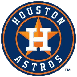
The current logo is a slightly beveled white “H” that is on top the orange star on a blue circle with two orange rings and a wordmark “HOUSTON” and “ASTROS” on top and bottom of the “H” and star.
Astros Primary Logo
The Houston Astros have a long and distinguished history of logos that represent the team’s proud legacy. The very first logo was introduced in 1965 when the team was still known as the Colt .45s, featuring an image of a cowboy with his gun drawn above crossed baseball bats. This logo remained until 1975 when it was replaced by an orange starburst design with “Astros” written across it in blue lettering. This new look became synonymous with Houston's Major League Baseball franchise for many years to come and is even featured on some merchandise today as a tribute to its longevity.
Today, fans can proudly wear apparel or accessories sporting this iconic emblem knowing that they are showing support for not only one of baseball's best teams but also honoring over the half-a-century worth of tradition behind them - all at once! It is no wonder why so many people recognize these three stars: because together they embody everything great about being part Houston Astros fan!
Houston Astros
2000 - 2013
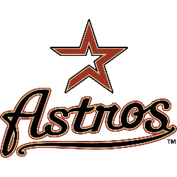
In 2000 the logo featured a scripted wordmark "Astros" in black with brick and tan trim and with swash underneath and the endless layers of colored strokes. A brick and tan star above "Astros" script.

Houston Astros
1995 - 2000
Getting ready to leave the Astrodome, as the dome is removed from the logo. The new variation of the logo is a shooting gold star with the wordmark "ASTROS" in blue with a white trim. A wordmark "HOUSTON" about the star in blue.
Houston Astros
1994 - 1995
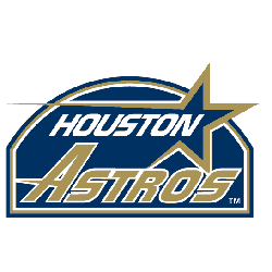
New logo design with a shooting gold star and a wordmark "HOUSTON" in white and inside the star. Below the star is a wordmark "ASTROS" in gold with white trim, inside the navy blue Astrodome.

Houston Astros
1975 - 1994
The Astros logo in 1975 slightly changed with a new smaller image of the Astrodome in blue and white with four baseballs rotating around the stadium. The wordmark "ASTROS" is now below and angled around the stadium on a orange background.

Houston Astros
1965 - 1975
An image of the Astrodome in white and blue with four baseballs rotating around the stadium. A wordmark "ASTROS" in blue with white trim on a orange circle background.
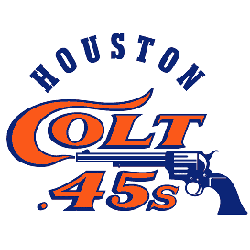
Houston Colt 45's
1962 - 1964
The only logo for the Colt 45's is a blue gun with smoke forming the letter "C" of the word "Colt" scripted above the gun and a wordmark ".45s" underneath the gun. A wordmark on top "HOUSTON" in blue.
Baseball Sports Fan Products

Time to Vote Astros Fans
Click to go to MLB Logo Battle and vote
Houston Astros Logo History Revealed: Unlocking the Secrets!
Dive into the vibrant evolution of the Houston Astros logo! 🌟 From their classic designs to the modern look we love today, the Astros' logo history is a journey through time.


