The Brooklyn Dodgers wordmark logo collection showcases the team’s historic MLB roots. With elegant script evoking urban nostalgia, the Brooklyn Dodgers logo captures team spirit. This collection explores team history, connecting fans with the enduring legacy of Brooklyn Dodgers baseball.

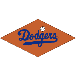
Brooklyn Dodgers
1952 - 1957
The "Dodgers" wordmark on a bronze diamond with a baseball above the letter "g."

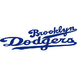
Brooklyn Dodgers
1938 - 1944
Slanted scripted wordmark "Brooklyn" in blue with an underscore and scripted wordmark "Dodgers" in blue with an underscore.
Font: Custom
The Nostalgic Brooklyn Dodgers Logo
An elegant script design defines the Brooklyn Dodgers logo in this timeless wordmark collection. Team history weaves vintage charm with city-inspired style, reflecting the Dodgers’ Brooklyn era. Fans adore Brooklyn Dodgers logo PNG designs for their clean look. Additionally, check the Brooklyn Dodgers Primary Logo. It provides unique wordmark styles for collectors. These logos fuel fan excitement, embodying the team’s historic legacy daily.
Brooklyn Dodgers wordmark logos bring baseball games to life with classic style. Drawing from Brooklyn Dodgers logo history, old Brooklyn Dodgers logo designs stir passion in fans. Furthermore, logo PNG artwork grabs collectors with clear detail. Visit the official Brooklyn Dodgers Wikipedia page. Consequently, fans cherish Dodgers baseball heritage, celebrating the team’s nostalgic wordmark identity with enthusiasm.
