New York Mets
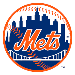
A scripted wordmark, “Mets” trimmed in white, was placed upon a blue skyline of New York. The buildings on the Mets logo are a generic church spire, the Williamsburgh Savings Bank, the Woolworth Building, the Empire State Building, and the United Nations. A white bridge and the orange stitches of a baseball are placed in front of the skyline.
The initials “NY” insignia on the left side was removed.

New York Mets
1993 - 1999
A scripted wordmark, "Mets" trimmed in white, was placed upon a blue skyline of New York. The buildings on the Mets logo are a generic church spire, the Williamsburgh Savings Bank, the Woolworth Building, the Empire State Building, and the United Nations. A white bridge is placed in front of the skyline, as are the orange stitches of a baseball. Finally, the initials "NY" in orange are positioned on the left side.
A new shade of orange is now darker.

New York Mets
1981 - 1993
A scripted wordmark "Mets" trimmed in white placed upon a blue skyline of New York. The buildings on the Mets logo are a generic church spire, the Williamsburgh Savings Bank, the Woolworth Building, the Empire State Building, and the United Nations. A white bridge is placed in front of the skyline, as are the orange stitches of a baseball. Finally, the initials "NY" in orange positioned on the left side.
A new shade of orange.

New York Mets
1962 - 1981
A scripted wordmark "Mets" trimmed in white placed upon a blue skyline of New York. The buildings on the Mets logo are a generic church spire, the Williamsburgh Savings Bank, the Woolworth Building, the Empire State Building, and the United Nations. A white bridge is placed in front of the skyline, as are the orange stitches of a baseball. Finally, the initials "NY" in orange positioned on the left side.
The Iconic New York Mets Logo
The New York Mets logo energizes MLB games. Rooted in New York Mets logo history, it inspires fans. Furthermore, New York Mets logo wallpaper and New York Mets logo PNG files thrill collectors. Visit the official New York Mets MLB page. Discover the team’s past, roster, and updates.
Baseball Sports Fan Products
