The Detroit Tigers wordmark logo collection celebrates the team’s storied MLB legacy. Featuring bold Old English D designs, the Detroit Tigers logo ignites team spirit. This collection highlights team history, uniting fans with the vibrant heritage of Detroit Tigers logo baseball.

Detroit Tigers
2016 - Present
Olde English style letter “D” in navy blue. A new style of olde english lettering.
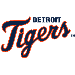
Detroit Tigers
1994 - Present
Double lined wordmark "DETROIT" in navy blue above "Tigers" scripted in navy with orange outline.
Font: Collins Old English Regular
https://deltafonts.com/detroit-tigers-font/
Detroit Tigers Logo History: Unveiling the Changes!
Explore the fascinating evolution of the Detroit Tigers logo in this comprehensive video. From its origins to the present day, we delve into the transformations and design choices that have shaped the Tigers' iconic emblem.
The Classic Detroit Tigers Logo
A bold Old English D design shapes the Detroit Tigers logo in this timeless wordmark collection. Team history blends classic styles with fierce appeal, reflecting the Tigers’ iconic identity. Fans cherish old Detroit Tigers logo designs for their nostalgic charm. Additionally, check the Detroit Tigers Primary Logo. It offers unique designs for collectors. These logos spark fan enthusiasm, embodying the team’s enduring legacy daily.
Alternate Detroit Tigers logos energize baseball games with vintage flair. Drawing from team heritage, Detroit logo baseball designs evoke passion among supporters. Furthermore, old Detroit Tigers logo artwork captivates collectors with sharp detail. Visit the official Detroit Tigers Wikipedia page. Consequently, fans embrace Detroit Tigers baseball heritage, celebrating the team’s classic identity with spirited enthusiasm.

