Washington Senators
1957 - 1960
A caricature of a U.S. Senator winding up to throw a pitch and a wordmark of the team name "SENATORS" behind on blue and red circle. Washington Monument also in the background.
Washington Senators
1959 - 1960
A pitching politician with a wind up in black and white holding a glove with a red circle background and a black trim outline.

Washington Senators
1955 - 1958
A green and cream Capitol building behind a baseball player catching a baseball on top of a yellow circle. A wordmark "WASHINGTON SENATORS" at the bottom in black and yellow.

Washington Senators
1955 - 1958
The Senators continued with the same logo as the final logo from the Nationals.
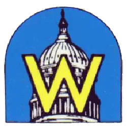
Washington Nationals
1948 - 1954
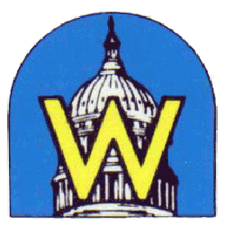
New Nationals logo featured a yellow block letter "W" on top of the capital building on a arched light blue background.
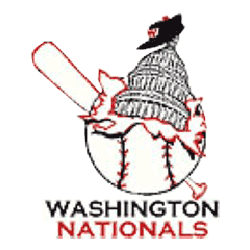
Washington Nationals
1936 - 1956
A wordmark under the logo "WASHINGTON" in black and "NATIONALS" in red. The logo is a white baseball with the capital building bust in out of the baseball and a Washington cap hang at the top. Also, a baseball bat behind the baseball.
Washington Nationals
1926 - 1927
A red, white and blue United States of American flag laid out in a shield with yellow trim.
The Timeless Washington Senators Logo
Alternate Washington Senators logos energize baseball games with retro flair. Rooted in Washington Senators logo history, the Washington Nationals logo nods to its past. Furthermore, Washington Senators logos captivate collectors with crisp detail. Visit the official Washington Senators Wikipedia page. Discover the franchise’s legacy. Consequently, fans embrace Washington Senators baseball heritage with spirited enthusiasm.


