Seattle Mariners
The Seattle Mariners new logo design comprises of an 8-pointed compass that rests on a baseball. A wordmark “SEATTLE MARINERS” encircled in a northwest green ring with metallic silver, then white and then metallic silver outline. This logo was designed by the Mariners and Major League Baseball.

Seattle Mariners
1987 - 1993
The “M’s” is the nickname of the Seattle Mariners which also featured in the team’s logo from 1987 - 1992. The "M's" in blue with a yellow trim on a white baseball with blue seams.

Seattle Mariners
1980 - 1987
The Mariners changed their logo to a large blue trident shaped as an "M" on a white with blue border star.
Seattle Mariners
1977 - 1980
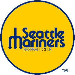
The original Seattle logo, a wordmark "Seattle Mariners" and on the bottom "BASEBALL CLUB" with a blue trident "M" on a round circle yellow background.
The Nautical Seattle Mariners Logo
The Seattle Mariners logo energizes MLB games. Rooted in Seattle Mariners logo history, it honors the old Seattle Mariners logo. Furthermore, the new Seattle Mariners logo inspires fans. Visit the official Seattle Mariners MLB page. Discover the team’s legacy, roster, and updates. Consequently, fans connect with Mariners pride.
Baseball Sports Fan Products


