San Francisco Giants
In 2000, the Giants logo had again very minor changes, the white baseball has some cream tinting to give it a 3-D effect. Also, a wordmark of black with orange outline “GIANTS.”
San Francisco Giants
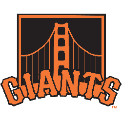
2015 - Present
Span of the Golden Gate Bridge in orange on a black background, "GIANTS" wordmark arched below in orange. Worn on sleeve of San Francisco Giants black alternate uniform starting in 2015.
San Francisco Giants
2000 - Present
“Giants” scripted across a white with orange stitches baseball. Wordmark “SAN FRANCISCO” and “BASEBALL CLUB” around the baseball.
The primary logo with the wordmark added “SAN FRANCISCO BASEBALL CLUB.”

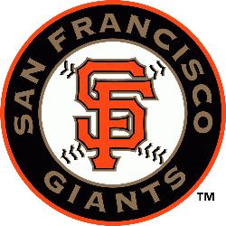
San Francisco Giants
2000 - 2013
Orange with black and gold trim initials "SF" on a baseball in black circle with a orange border. In the black circle is the wordmark "SAN FRANCISCO GIANTS" in gold.
San Francisco Giants
1973 - 1979
"Giants" in black scripted diagonally on an orange with orange seams baseball.
Former primary logo, retired in 1972 and became a alternate logo.
San Francisco Giants
1958 - 1976
"Giants" in black scripted diagonally on a white with orange seams baseball.
Final New York Giants logo that was moved to alternate logo in 1958.

Revealing the History of the San Francisco Giants Logo!
In this Video, We Explore the history of the San Francisco Giants logo! In this video, we explore the evolution and significance of the iconic emblem throughout the team's history. From its humble beginnings to its modern-day representation, join us on a journey through time as we uncover the secrets behind the San Francisco Giants logo. Don't miss out on this fascinating exploration - watch now!
The Bold San Francisco Giants Logo
Alternate Giants logos energize San Francisco Giants logo baseball games with flair. Rooted in Giants logo history, these designs spark fan passion. Furthermore, San Francisco Giants logo PNG files captivate collectors with timeless appeal. Visit the official San Francisco Giants MLB page. Discover the franchise’s legacy. Consequently, fans embrace the enduring Giants tradition.


