Philadelphia Phillies
Wordmark “Phillies” scripted in red on a blue Liberty Bell. Simplified version of previous logo, diamond removed, blue darkened, underline removed, and bell tweaked slightly.
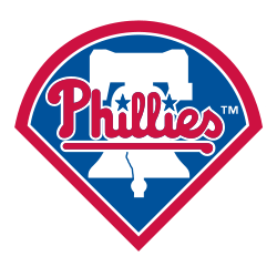
Philadelphia Phillies
1992 - 2019
The latest logo is comprises of a blue baseball infield trimmed in white and scarlet red with a white Liberty Bell inside and "Phillies" in scarlet red wordmark and underscore with blue stars dotting the "I"s in white trim.
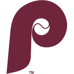
Philadelphia Phillies
1982 - 1992
A maroon letter "P" with a baseball in the center of the letter "P." The letter "P" represents the team nickname Phillies.

Philadelphia Phillies
1981 - 1982
A red letter "P" with a baseball in the center of the letter "P." The letter "P" represents the team nickname Phillies.
Philadelphia Phillies
1976 - 1981
In 1976 the Phillies debuted their short lived mascots Phil and Phyllis. Phil and his counterpart Phyllis were children dressed in colonial garb. Phil is seen tossing a baseball and holding a bat while Phylis is ready to play with her glove. A wordmark “Phillies” in red with a baseball inside the letter “P” and a red border.
Philadelphia Phillies
1970 - 1976
A red letter "P" with a baseball in the center of the letter "P" and a wordmark below "phillies" in red.
Philadelphia Phillies
1950 - 1970
The Phillies logo changed to a red Phillies cap with a baseball circling around the cap with four blue stars. A wordmark "Phillies" in red circling as well.
Philadelphia Phillies
1946 - 1950
In 1946 the Phillies changed logos to a square red background with a bat at the bottom. On top is a Phillies baseball player sliding with a catcher attempting to catch a baseball. A wordmark below the players "Fight-in Phillies" in white.
Philadelphia Phillies
1944 - 1946
This logo features a blue jay perching atop scripted wordmark “Phillies” in red.

Philadelphia Phillies
1939 - 1944
Again same emblem with new colors. Philadelphian standing in the middle of a light blue baseball diamond and a circle with grey ring with an red trim. A yellow wordmark "PHILADELPHIA NATIONAL LEAGUE BASEBALL CLUB."
Philadelphia Phillies
1938 - 1939
Same emblem with new colors. Philadelphian standing in the middle of a yellow baseball diamond and a circle with yellow ring with an blue trim. A yellow wordmark "PHILADELPHIA NATIONAL LEAGUE BASEBALL CLUB."
Philadelphia Phillies
1915 - 1938
The original Phillies logo of a Philadelphian standing in the middle of a dark blue baseball diamond and a circle with red ring with an blue trim. A white wordmark "PHILADELPHIA NATIONAL LEAGUE BASEBALL CLUB" on red background.

Philadelphia Phillies
1911 - 1915
A red letter "P."
Philadelphia Phillies
1910 - 1911
Green letter "P" in olde style english font.

Philadelphia Phillies
1901 - 1910
A black letter "P."

Philadelphia Phillies
1900 - 1901
A blue letter "P."
The Bold Philadelphia Phillies Logo
The Philadelphia Phillies logo energizes MLB games. Rooted in Philadelphia Phillies logo history, it honors the old Philadelphia Phillies logo. Furthermore, the Philadelphia Phillies retro logo inspires nostalgia. Visit the official Philadelphia Phillies MLB page. Discover the team’s legacy, roster, and updates. Consequently, fans connect with the Phillies’ spirit.
Baseball Sports Fan Products


