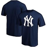
New York Yankees
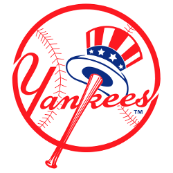
The Yankees logo design highlighted with a red bat which extends to become the vertical line of the “K” of the red wordmark “Yankees.” Also the logo consists of an Uncle Sam top hat that is red, white and blue in color and hangs on the baseball bat on top of a white baseball with red seams. The powder blue under brim of the hat was removed from the previous logo.

New York Yankees
1947 - 1968
The primary logo, created in 1947 by sports artist Henry Alonzo Keller, consists of "Yankees" against a baseball, written in red script with a red bat forming the vertical line of the K, an Uncle Sam hat hanging from the barrel.
New York Yankees
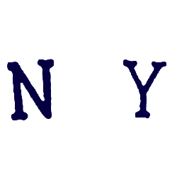
1915 - 1947
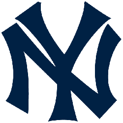
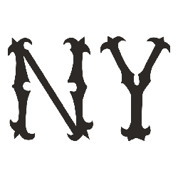
Continued with the same font and the interlocking "NY" now in a dark blue color. The letters "NY" represent the city of New York.
New York Yankees
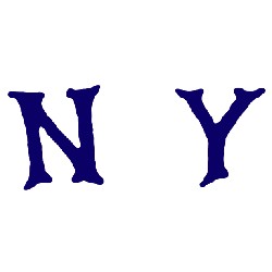
1913 - 1915
The Yankees changed the font style, but continue the interlocking "NY" now in a brown color.

New York Highlanders
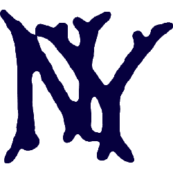
1909 - 1912
It wasn't until 1909 that the team changed to the familiar interlocking NY that would be the team logo long after the team became known as the Yankees. The interlocking NY was originally designed by Louis C. Tiffany.
New York Highlanders
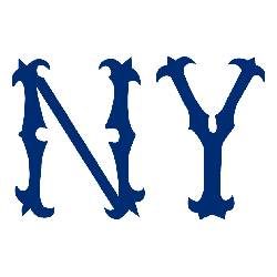
1908 - 1909
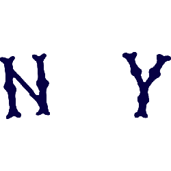
A new font style, again with distance between the old english letters "NY" in a dark blue. The letters "NY" represent the city of New York.
New York Highlanders
1907 - 1908
Different font with the distance between letters. Use of an olde english letter "NY" in a darker blue. The letters "NY" represent the city of New York.
New York Highlanders
1906 - 1907
New font used with a greater distance between the letters. An old english style letter of "NY" in a lighter blue. The letters "NY" represent the city of New York.
New York Highlanders
1905 - 1906
A new style of old english letters "NY" in a darker blue. The letters "NY" represent the city of New York.
New York Highlanders
1904 - 1905
In 1904 the team used the same font with a change in color to blue. The letters "NY" represent the city of New York.
New York Highlanders
1903 - 1904
The first logo for the Highlanders is an old english letters "NY" in the color brown. The letters "NY" represent the city of New York.
Baltimore Orioles
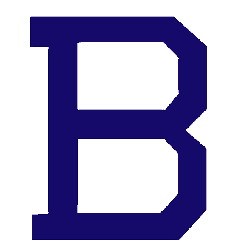
1901 - 1902
The final logo was a change in letters from "O" to a blue block letter "B." The letter "B" stands for the city of Baltimore.
Baltimore Orioles
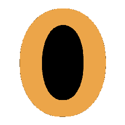
1900 - 1901
The Orioles original logo is a orange block letter "O" with a black inside color. The letter "O" stands for the team nickname Orioles.
New York Yankees Logo History
The New York Yankees Primary logo has remained a central part of the team’s visual identity. Each version in the New York Yankees logo history preserved classic elements while refining details over time. For official franchise information, visit the New York Yankees Wikipedia page. You can also review design variations on the New York Yankees Alternate logo page.
High-quality New York Yankees logo PNG files allow fans to examine every primary design clearly. In addition, each New York Yankees Primary logo appeared on uniforms, caps, and official merchandise. Therefore, reviewing all versions together helps explain how the New York Yankees logo history maintained consistency while adapting to modern branding standards.
Studying the New York Yankees logo history through primary logos highlights long-term branding discipline. Each New York Yankees Primary logo reflects its era without losing identity. This archive preserves every primary design, allowing fans to follow the Yankees’ visual legacy from early seasons to the present day.
Baseball Sports Fan Products


Time to Vote Yankees Fans
Click to go to MLB Logo Battle and vote


