New England Revolution
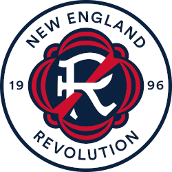
A stylized letter “R”, invoking the club’s name, in a style reminiscent of the Revolutionary War era. A red strikethrough of the letter “R” roots the club’s identity in the defiant and patriotic spirit of the American Revolution. The seal is bordered by a design emblematic of traditional flag drapery with details embodying patriotic bunting. To form the official crest, a wordmark “NEW ENGLAND REVOLUTION” in the blue and inaugural season – 1996 – are inscribed in a circle with a navy blue border.

New England Revolution
1996 - Present
Wordmark "NEW ENGLAND" and in a custom font (paintbrush) "REVOLUTION" in blue.
Font: Sans-serif
https://www.fontsquirrel.com/fonts/list/classification/serif

New England Revolution
1996 - Present
Wordmark in a custom font (paintbrush) "REVOLUTION" in blue.
Font: Sans-serif
https://www.fontsquirrel.com/fonts/list/classification/serif
New England Revolution Wordmark Logo
The New England Revolution logo history is famous for using the longest-running original crest in MLS. For over 25 years, the New England Revolution wordmark logo featured a custom "paintbrush" font in blue and black. This style complemented the famous "Crayon Flag" that fans loved at Gillette Stadium. You can discover more about these historic milestones on the official New England Revolution History page.
Furthermore, the New England Revolution logo history took a bold step forward in 2021 with a complete brand refresh. The new New England Revolution wordmark logo now features a custom font inspired by Revolutionary War era documents. Fans often search for a New England Revolution logo PNG to see the red "strikethrough" on the letter R. While the wordmark looks great on gear, the New England Revolution Primary logo remains the core symbol of the "Revs" identity.
The New England Revolution logo history reflects a team that honors its past while looking toward the future. Every version of the New England Revolution wordmark logo builds on the "Bring the Fight" mantra. High-quality New England Revolution logo PNG files are vital for supporters who want to celebrate the club's 1996 roots. This visual style continues to inspire the "Midnight Riders" and soccer fans across the region with its strong, professional, and authentic charm.
"Every Club Has a Story. Every Kit Tells It"
From the original '96 franchises to the newest expansion stars, MLS history is written in the colors of the community. Rep your club’s journey and wear the crest that defines your city’s legacy on the pitch.
Shop the Official MLS Collection


