
Los Angeles FC
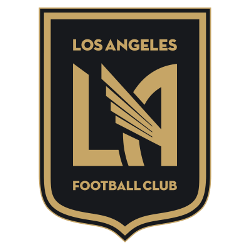
A black with a gold trim shield with the initials “LA” with wings coming out of the letter “A” and wordmark “LOS ANGELES” in gold on top and below “FOOTBALL CLUB” in gold.

Los Angeles FC
2018 - Present
A black with a gold trim shield with the initials “LA” with wings coming out of the letter "A" and wordmark "LOS ANGELES" in gold on top and below "FOOTBALL CLUB" in gold.
"Every Club Has a Story. Every Kit Tells It"
From the original '96 franchises to the newest expansion stars, MLS history is written in the colors of the community. Rep your club’s journey and wear the crest that defines your city’s legacy on the pitch.
Shop the Official MLS Collection







Los Angeles FC Fans Time to Vote
Prepare yourself for the MLS Team Logo Battle by standing behind the bold identity of Los Angeles FC. The winged monogram set against a striking gold and black shield symbolizes ambition, speed, and relentless competitive drive. More than a crest, it reflects a modern powerhouse within Major League Soccer, confidently challenging rival emblems with authority and style.
Deeply connected to the energy of Los Angeles, the logo represents unity, resilience, and unwavering pride. The soaring wing detail conveys motion and aspiration, reinforcing the club’s pursuit of excellence. In any logo showdown, LAFC’s emblem doesn’t just stand out—it takes flight, embodying the indomitable spirit of the team and its devoted supporters.
Click to go to MLS Logo Battle and vote
Los Angeles FC Primary Logo
The Los Angeles FC logo history is rooted in the "Heart of the City" concept. The Los Angeles FC primary logo features a classic shield shape derived from the city’s seal, adorned with a winged "LA" monogram. This Art Deco design honors the city's architectural heritage. If you need a high-quality Los Angeles FC logo png, our archive provides the most accurate versions. For a deeper look at the club's rise, visit the Los Angeles FC team history page.
Throughout the Los Angeles FC logo history, the club has maintained a bold black and gold palette. The winged element in the Los Angeles FC primary logo represents speed, flight, and the city’s "City of Angels" nickname. We offer various versions of the Los Angeles FC logo png for fans and historians alike. While the shield is the main identity, you can also explore creative variations on our Los Angeles FC alternate logo page.
In 2026, the Los Angeles FC primary logo continues to define modern sports branding. The Los Angeles FC logo history shows a commitment to a timeless aesthetic that transcends the pitch. By providing a clear Los Angeles FC logo png, we help supporters maintain the integrity of the club's visual identity. Whether you are studying the Los Angeles FC logo history or looking for the newest crest, our collection captures the essence of the club.