New York Red Bull
Two red bulls charging a black and white soccer ball with a yellow background on a white with blue trim shield. Two wordmark “Red Bulls” in red on top and “NEW YORK” arched in blue on the bottom.
In 2007 the Red Bull’s enlarged their primary logo and did a redesign on the red bulls.
Red Bull Primary Logo
The New York Red Bull has been a part of Major League Soccer since 1996, and their primary logo has gone through several iterations in that time. The original logo featured an image of the Empire State Building with two bulls on either side. This design was used until 2002 when it was replaced by a more modernized version featuring three red bulls set against a white background with black outlines and “NEW YORK” written across the top in all caps.
In 2006, the team unveiled its current primary logo which features only one bull standing atop an abstract shield shape composed of two triangles representing both New York City and soccer itself. The color scheme remains unchanged from previous logos; however, there are subtle changes to how each element is presented such as adding shading to give depth to certain parts like the bull’s horns or making sure all lines remain crisp for maximum impact when seen from afar or up close alike.
The latest redesign also includes small details such as stars around the perimeter symbolizing victory while also connecting back to American patriotism due to its iconic use on flags throughout history; this helps give fans something they can rally behind no matter what country they call home while still maintaining ties to NYC's cultural heritage at large too! Overall, this simple yet powerful emblem has become synonymous with not just MLS but professional sports teams everywhere who strive for greatness every day –– proving that even decades later some things never go out of style!
New York Red Bull
2006 - 2008
Two red bulls charging a black and white soccer ball with a yellow background on a white with blue trim shield. Two wordmark "Red Bulls" in red on top and "NEW YORK" arched in blue on the bottom.
MetroStars
2002 - 2006
Wordmark "MetroStars"in white and a custom font on a red and black shield with
a white star and a white and black football.
MetroStars
1998 - 2002
A red with a black and orange trim letter "M" shaped like a lightning bolts. Above the letter is a black and great NY cityscape and wordmark positioned on the letter "METROSTARS" in white.
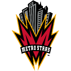
New York/New Jersey MetroStars
1996 - 1998
A red with a black and orange trim letter "M" shaped like a lightning bolts. Above the letter is a black and great NY cityscape and wordmark positioned on the letter "METROSTARS" in white.
College Sports Fan Products
The MLS League Teams Logo Battle is heating up, and New York Red Bull fans have a chance to show their support for their favorite team! With the competition in full swing, it's time to rally behind your club and make sure they come out on top. Show your spirit by voting for the Red Bulls logo - don't miss this opportunity to help them win!


