Sporting Kansas City
A grey shield with a wordmark “KANSAS CITY” in white at the top of the shield. Below the wordmark is a blue with a white trim mini shield with a wordmark “SPORTING” in white above light blue stripes next to custom font interlocked initials “SC” in white.
Sporting Kansas City Primary Logo
Sporting Kansas City is a professional soccer team based in Kansas City, Missouri. The team has had a long and successful history since its inception in 1995 as the Kansas City Wiz. Over the years, Sporting KC has gone through many changes and updates to its logo designs to reflect its evolution as an organization. This essay will discuss some of these primary logo histories that have been used by Sporting KC throughout its existence.
The original design for the first incarnation of Sporting KC was created by Bob Griese in 1996 when they were known as the “Kansas City Wiz” or “KCW” for short. This design featured two blue halves with white stars inside them which represented both sides of American culture - East and West respectively - while also symbolizing unity among fans from different backgrounds who supported this club together at games back then. It also included a yellow star on top which stood out against all other colors present within this emblem representing success achieved within this sport during those early days under such name change before finally adopting "Sporting" into its identity permanently after the 2000 season ended.
In 2010, there was another major redesign made with help from Major League Soccer (MLS) Creative Services Director Paul Mabry; focusing more on modernity than tradition but still keeping elements like the blue color palette intact due to fan loyalty towards it over time. As result, we got our current primary mark featuring three separate parts: A shield shape outline surrounding lettering spelling out 'SPORTING' along with iconic font style plus a crown placed above the wordmark; all set against bright background color red instead of the dark one used previously. The combined look gave us something much more contemporary yet still recognizable enough to be able to differentiate itself from the rest teams competing in MLS today making the perfect choice to go alongside new rebranding efforts taken place around the same year too ultimately giving rise to what now stands proud official badge and most beloved football clubs North America!
Overall, Sporting Kansas City has gone through several iterations of logos throughout its history – each one reflecting where they are currently standing at any given moment while staying true to core values held close to the heart to every single fan supporting them no matter how far away home may be located geographically speaking! From simple beginnings back in 1996 till the modern-day masterpiece seen today, the journey behind the creation of the Primary Logo is truly a remarkable testament hard work put forth by countless individuals to make sure the right message gets sent across the world about passion shared between players & supporters alike!
Kansas City Wizards
2007 - 2010
Wordmark "KANSAS CITY" in blue and different size font "WIZARDS" in white on a black shield.
Kansas City Wizards
2000 - 2007
Soccer ball with rainbow streamers in a light blue half circle and different size font wordmark "WIZARDS" below in shield.
The shade of blue altered for 2000 season
Kansas City Wizards
1997 - 2000
Different size font wordmark "WIZARDS" in white under a light blue semi circle, a soccer ball flying by with yellow, green, red, and blue trails.
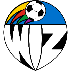
Kansas City Wiz
1996 - 1997
Soccer ball with rainbow streamers trailing with wordmark "WiZ" below in shield.
College Sports Fan Products
Sporting Kansas City fans, join in on the MLS League Teams Logo Battle and show your support for SKC! Vote now to help make sure Sporting KC's logo is victorious over all other teams. Let’s get out there and represent our city with pride!


