
Montreal Impact
2012 - 2020
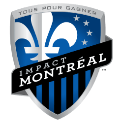
A white fleur-de-lis on a blue shield with four grey stars, a black banner with the team name and vertical blue and black bars below. Tous Pour Gagner (French for All To Win) is at the top of the shield. The four stars represent the original settlers of the city of Montreal - the French, English, Irish, and Scots. The black and blue stripes are a tribute to the club's first championship in 1994.

Montreal Impact
2012 - 2020
A white fleur-de-lis on a blue shield with four grey stars, a black banner with the team name and vertical blue and black bars below. Tous Pour Gagner (French for All To Win) is at the top of the shield. The four stars represent the original settlers of the city of Montreal - the French, English, Irish, and Scots. The black and blue stripes are a tribute to the club's first championship in 1994.
"Every Club Has a Story. Every Kit Tells It"
From the original '96 franchises to the newest expansion stars, MLS history is written in the colors of the community. Rep your club’s journey and wear the crest that defines your city’s legacy on the pitch.
Shop the Official MLS Collection







Montreal Impact Logo History
The Montreal Impact logo history began in 1992 when the Saputo family founded the club. The original Montreal Impact logo featured a blue shield with white fleurs-de-lis to honor Quebec's heritage. This design stood for the team's commitment to the local community. It stayed as the primary face of the club through its early years in the APSL and A-League. You can learn more about these championship years on the official history page.
A major shift in the Montreal Impact logo history occurred when the club joined Major League Soccer in 2012. The new Montreal Impact logo updated the shield with a silver border and added four stars. These stars represent the original settler communities of Montreal. Fans often look for a Montreal Impact logo PNG from this era to see the "Tous Pour Gagner" motto. While this was the main mark for years, the brand eventually transitioned into the current era of Canadian rivalries.
The Montreal Impact logo history reached its final stage before the 2021 rebrand to CF Montréal. In 2015, the club made small tweaks to the Montreal Impact logo to emphasize its place in the Eastern Conference. These changes added black outlines to make the shield pop. Every Montreal Impact logo PNG from this period reflects a club that grew into a continental power. This visual journey shows a team that always aimed to make a lasting "impact" on the sport in Canada.