Kansas City Wizards
2007 - 2010
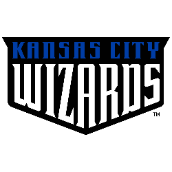
Wordmark "KANSAS CITY" in blue and different size font "WIZARDS" in white on a black shield.

Kansas City Wizards
2007 - 2010
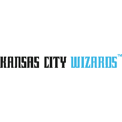
A single-lined wordmark "KANSAS CITY" in black and "WIZARDS" in light blue.
Font: Custom
Kansas City Wizards Logo History
The Kansas City Wizards logo history began with a vibrant, rainbow-themed wordmark that debuted during the 1996 season. This original Kansas City Wizards MLS typography utilized a playful font with a multi-colored trail, symbolizing the "magic" of the team. Because the club wanted a family-friendly and approachable image, the initial KC wizards logo text was bright and energetic. This look helped establish the franchise as a cornerstone of the Midwest sports scene during the league's formative years.
As the team matured, the Kansas City Wizards logo history shifted toward a more sophisticated and professional aesthetic. The club eventually simplified the Kansas City Wizards MLS wordmark, adopting a sleek navy and white color palette that reflected their 2000 MLS Cup success. You can visit our Kansas City Wizards primary logo page to see how these different fonts paired with the famous "W" rainbow shield. Even after the transition to the Sporting KC era, the classic KC wizards logo remains a nostalgic favorite for long-time supporters.
Ultimately, the Kansas City Wizards MLS wordmark serves as a historical record of the club's journey from an expansion team to a league champion. We provide high-resolution images of every Kansas City Wizards logo history text variation to ensure the best quality for researchers and fans. You can also read the full Kansas City Wizards history to understand the stories behind these iconic branding changes. By analyzing each KC wizards logo, enthusiasts can appreciate how the team's vi
"Every Club Has a Story. Every Kit Tells It"
From the original '96 franchises to the newest expansion stars, MLS history is written in the colors of the community. Rep your club’s journey and wear the crest that defines your city’s legacy on the pitch.
Shop the Official MLS Collection


