
San Diego FC
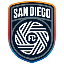
The club’s official colors were labeled in the explainer as “chrome and azul,” while the crest is said to center around four “principal virtues” that define San Diego: “Gratitude, pride, not loud, diversity and a state of flow.” That flow motif is evident in the central portion of the crest, which the club points out consists of “18 lines representing the 18 communities of San Diego County.”

San Diego FC
The club’s official colors were labeled in the explainer as “chrome and azul,” while the crest is said to center around four “principal virtues” that define San Diego: “Gratitude, pride, not loud, diversity and a state of flow.” That flow motif is evident in the central portion of the crest, which the club points out consists of “18 lines representing the 18 communities of San Diego County.”
"Every Club Has a Story. Every Kit Tells It"
From the original '96 franchises to the newest expansion stars, MLS history is written in the colors of the community. Rep your club’s journey and wear the crest that defines your city’s legacy on the pitch.
Shop the Official MLS Collection








San Diego FC Fans Time to Vote
Get ready for the MLS Team Logo Battle as the San Diego FC logo faces off against rival team crests. The San Diego FC primary logo features a bold wave design set against a striking backdrop, reflecting the club’s coastal identity and competitive ambition. Inspired by the energy and culture of San Diego, this emblem represents strength, unity, and forward momentum.
More than a graphic mark, the San Diego FC logo stands as a symbol of pride, resilience, and loyalty. Supporters rally behind this distinctive crest as it competes for recognition in the ultimate team logo battle. With its dynamic wave concept and strong visual presence, the San Diego FC emblem captures the passion and determination that define the club and its fans.
Click to go to MLS Logo Battle and vote
San Diego FC Primary Logo
The San Diego FC primary logo made its official debut in 2023, marking a pivotal moment in the San Diego FC logo history. Designed to reflect the spirit of the region, the San Diego FC primary logo features a circular crest famously known as "The Chrome." You can read more about the club's founding journey on the team history page.
Delving into the San Diego FC logo meaning, the 18 lines in the center represent the 18 distinct communities within San Diego County. This focus on unity is a central theme in the San Diego FC logo history. While this shield is the main identity, the San Diego FC alternate logo offers a different aesthetic for supporters.
As a newcomer to professional soccer, the San Diego FC primary logo stands out with its unique "Chrome and Azure" color palette. Throughout the San Diego FC logo history, this emblem has aimed to merge local tradition with a futuristic feel. Today, the San Diego FC primary logo is a symbol of local pride and professional excellence.