
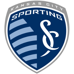
Sporting Kansas City
A grey shield with a wordmark “KANSAS CITY” in white at the top of the shield. Below the wordmark is a blue with a white trim mini shield with a wordmark “SPORTING” in white above light blue stripes next to custom font interlocked initials “SC” in white.

Sporting Kansas City
2011 - Present
A grey shield with a wordmark "KANSAS CITY" in white at the top of the shield. Below the wordmark is a blue with white trim mini shield with a wordmark "SPORTING" in white above light blue stripes next to custom font interlocked initials "SC" in white. Below is a wordmark "SPORTING KANSAS CITY" in blue.

"Every Club Has a Story. Every Kit Tells It"
From the original '96 franchises to the newest expansion stars, MLS history is written in the colors of the community. Rep your club’s journey and wear the crest that defines your city’s legacy on the pitch.
Shop the Official MLS Collection







Sporting Kansas City Alternate Logo
The Sporting Kansas City logo history is defined by its 2010 rebranding, which introduced the iconic "SC" monogram. Consequently, the Sporting Kansas City alternate logo often isolates these interlocking letters to symbolize the unity of "Sporting Club" and the state line between Kansas and Missouri. These designs utilize "Sporting Blue" and "Indigo" colors. You can find more specific branding details on the Kansas City team history page.
Furthermore, the Sporting Kansas City logo history includes a shield shape inspired by Spanish architecture and Greek mythology. Fans often search for a Sporting Kansas City logo PNG to highlight the 11 stripes on the crest, which represent the players on the field. While the primary shield is the main face, the Sporting Kansas City wordmark logo provides a clean typographic alternative for various media. These elements capture the club's "All for the City" mantra.
In short, the Sporting Kansas City logo history reflects a journey of professional growth and community passion. Every Sporting Kansas City alternate logo used in marketing reinforces the club's identity as a dominant force in the Western Conference. Therefore, the high-quality Sporting Kansas City logo PNG remains a favorite asset for supporters. This visual identity continues to inspire "The Cauldron" and soccer fans throughout the Midwest with its timeless, elegant charm.