Nashville SC
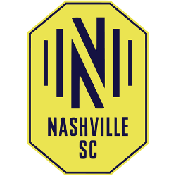
Blue sound waves on both sides of a blue letter “N” inside a yellow with blue trim octagon and below a wordmark “NASHVILLE SC” in blue.

Nashville SC
2020 - Present
Blue sound waves on both sides of a blue letter "N" inside a yellow with blue trim octagon and below a wordmark "NASHVILLE SC" in blue.
Nashville SC Logo History
Tracing the Nashville SC logo history reveals a deep connection to Tennessee’s identity. The initial branding featured an abstract design with blue circles and stars, symbolizing the intersection of music and sports. Today, the Nashville SC logo utilizes "Electric Gold" and navy blue, featuring an "N" monogram composed of sound waves. This unique design captures the energy of the city's fans. You can learn more about the club's rise on the Nashville SC team history page.
The current Nashville SC logo stands as a modern icon, emphasizing diversity and the "One Club" philosophy. Fans frequently utilize the Nashville SC logo PNG to celebrate the team's vibrant aesthetic, which blends traditional soccer imagery with the sonic heritage of Nashville. This branding journey is as distinct as the Inter Miami CF logo, showcasing how newer franchises create immediate impact. As you examine the Nashville SC logo history, it becomes clear that the crest is more than a symbol; it is the visual voice of the supporters.
In the present day, the Nashville SC logo is recognized for its bold soundwave bars and clean geometric lines. Our archive ensures that every step of the Nashville SC logo history is preserved, documenting how the club transitioned from USL concepts to a premier MLS identity. We provide the latest Nashville SC logo PNG formats to ensure the Electric Gold remains sharp across all digital platforms. Whether you are researching the Nashville SC logo origins or the latest updates, our comprehensive collection offers everything you need to know.
College Sports Fan Products

Nashville SC Fans Time to Vote
Gear up for the MLS Team Logo Battle by standing behind the bold identity of Nashville SC. The gold “N” set within a sleek silver octagon symbolizes unity, precision, and relentless ambition. More than a crest, it reflects the club’s steady rise and competitive resilience within Major League Soccer, confidently clashing with rival emblems in the ultimate showdown.
Deeply connected to the rhythm and pride of Nashville, the logo embodies harmony, strength, and unwavering loyalty. The octagonal design conveys structure and determination, while the bold gold accent reinforces confidence and energy. In any logo battle, Nashville SC’s emblem doesn’t just stand out—it resonates, capturing the indomitable spirit of the club and its devoted supporters.


