Inter Miami CF
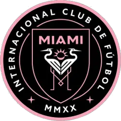
The crest, designed in style and colors that recall the city’s Art Deco architectural tradition, displays two great white herons with interlocking legs forming a letter M. Between the herons is an eclipse, the sun bearing seven rays in homage to the number Beckham often wore as a player. The team colors are black, pink, and white. The full achievement displays the team name encircling all with the roman numerals MMXX representing the year 2020, the planned inaugural season of play. Club full name: Club Internacional de Fútbol Miami.

Inter Miami CF
2020 - Present
The crest, designed in style and colors that recall the city's Art Deco architectural tradition, displays two great white herons with interlocking legs forming a letter M. Between the herons is an eclipse, the sun bearing seven rays in an homage to the number Beckham often wore as a player. The team colors are black, pink, and white. The full achievement displays the team name encircling all with the roman numerals MMXX representing the year 2020, the planned inaugural season of play.
Club full name: Club Internacional de Fútbol Miami.
Inter Miami CF Logo History
The Inter Miami CF logo is a masterclass in regional symbolism, featuring two Great White Herons whose interlocking legs form a subtle "M" for Miami. As a central piece of the Inter Miami CF logo history, this primary crest captures the essence of South Florida through its Art Deco-inspired typography and a signature palette of pink and black. Fans often search for a crisp Inter Miami CF logo PNG to showcase the eclipse at the top of the shield, which represents the club's 24-hour determination. This Inter Miami CF logo remains one of the most recognizable brands in global sports today. You can see how these elements have shifted through various seasons by visiting our detailed Inter Miami CF team history page.
When examining the Inter Miami CF logo history, it is clear that the club valued a timeless aesthetic from day one. Every detail of the Inter Miami CF logo was chosen to reflect the culture of Miami, including the seven rays of the sun that honor David Beckham’s famous jersey number. Our archive provides every version of the Inter Miami CF logo png used since the team’s inception. Because the Inter Miami CF logo history is so rich with intent, the primary crest has become a symbol of ambition. If you are looking for specific variations of the Inter Miami CF logo, our collection ensures you have access to the most accurate historical data.
College Sports Fan Products

Inter Miami CF Fans Time to Vote
Dive into the MLS Team Logo Battle by rallying behind the bold and modern identity of Inter Miami CF. The crest, featuring two elegant herons intertwined before a radiant solar eclipse, symbolizes unity, ambition, and competitive resilience. More than a visual mark, it reflects the club’s dynamic rise and fearless presence within Major League Soccer, standing confidently against rival emblems in the ultimate logo showdown.
Deeply connected to the vibrant energy of Miami, the logo conveys style, determination, and unwavering loyalty. The mirrored herons represent balance and strength, while the eclipse adds a sense of power and mystique. In the battle for supremacy, Inter Miami’s emblem doesn’t just compete—it soars, embodying the relentless drive and pride of the club and its devoted supporters.


