The Baltimore Orioles (1901) primary logo captures the team’s early MLB legacy. Featuring a bold design, the Milwaukee Brewers logo reflects its historical roots. This collection of primary logos showcases the Milwaukee Brewers logo history, uniting fans with the team’s pioneering spirit from 1901.
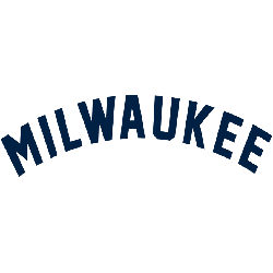
Milwaukee Brewers
1900 - 1901
Like most teams before 1900, the logo was a wordmark of the city “MILWAUKEE” in an arched pattern.

Milwaukee Brewers
1900 - 1901
Like most teams before 1900, the logo was a wordmark of the city “MILWAUKEE” in an arched pattern.
The Historic Milwaukee Brewers Logo
A striking design defines the Milwaukee Brewers logo, tied to the 1901 Baltimore Orioles. Its Milwaukee Brewers logo history includes the Milwaukee Brewers retro logo. Fans admire the new Milwaukee Brewers logo’s nod to tradition. Additionally, check the Baltimore Orioles Primary logo. It highlights more designs in this historic collection.
The Milwaukee Brewers logo energized 1901 MLB games. Rooted in Milwaukee Brewers logo history, the Milwaukee Brewers retro logo sparks nostalgia. Furthermore, the new Milwaukee Brewers logo honors the Orioles’ legacy. Visit the official Baltimore Orioles MLB page. Discover the team’s early history and updates. Consequently, fans connect with 1901 Orioles pride.


