Los Angeles Dodgers
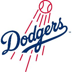
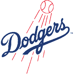
The 2012 updated logo, the most obvious change is the thicker line weight on the ball and streaks. There are also multiple edits incorporated into the wordmark. First off, the “O” no longer has a tail on the left side. In fact, the loss of the “O”’s tail allows for a cleaner presentation and allows the viewer to get directly into the word, instead of starting with the superfluous tail. The “E” has also been adjusted to appear that the line coming off the “G” flows smoothly into the stroke of the “E”. The old mark featured a disjointed connection between the two letterforms. Lastly, the wordmark’s tail was edited so it terminates with an inverted rounding line instead of a flat line, which more closely mirrors the wordmark from the team’s jerseys.
Los Angeles Dodgers
1979 - 2012
Wordmark script "Dodgers" is now on a diagonal incline with red baseball above with red streaking lines.
Los Angeles Dodgers
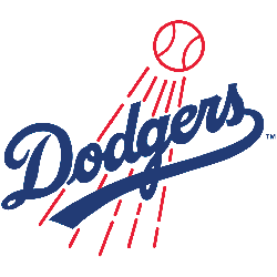
1972 - 1979
Wordmark "Dodgers" script in blue with shooting red baseball and a tail rapping below the wordmark.
Thicker font for the wordmark

Los Angeles Dodgers
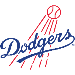
1968 - 1972
Wordmark "Dodgers" script in blue with a shooting red baseball and a tail rapping below the wordmark.
Los Angeles Dodgers
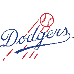
1958 - 1968
In the move to Los Angeles, the Dodgers logo went through a change as the wordmark "Dodgers" script in blue with shooting red baseball and a tail rapping below the wordmark.
Brooklyn Dodgers
1945 - 1957
Scripted wordmark "Dodgers" in blue in front of a red flying baseball with streaks.
Brooklyn Dodgers
1938 - 1945
Slanted scripted wordmark "Dodgers" in blue with an underscore.
Brooklyn Dodgers
1937 - 1938
A block letter "B" in green.
Brooklyn Dodgers
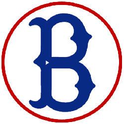
1932 - 1937
An old fashioned letter "B" in navy blue.

Brooklyn Robins
1930 - 1931
The Robins changed to a block letter "B" with the powder blue color.
Brooklyn Robins
1929 - 1930
The same style font from the previous year, with only color changes. The "B" is now red with a dark blue trim.

Brooklyn Robins
1928 - 1929
The Dodgers switched to a sky blue and put a red border around the "B."
Brooklyn Robins
1927 - 1928
In 1928, the font that is similar to Bruce Double Pica letter "B" in blue with a red circle around the "B."

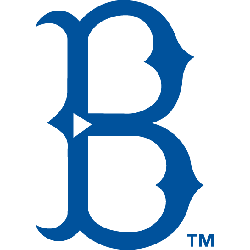
Brooklyn Robins
1926 - 1927
This is the same logo used by the Brooklyn Dodgers in 1912.
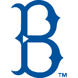
Brooklyn Robins
1914 - 1926
This is a recall of the same logo that the Superbas used in 1909.

Brooklyn Dodgers
1912 - 1913
The corners of the baseball field are connected, the logo was a little bigger, and the team was now called the Brooklyn Dodgers, eliminating the name "Trolley."

Brooklyn Trolley Dodgers
1911 - 1912
The team logo carried over from the logo in 1910, as the team was now called the Brooklyn Trolley Dodgers.

Brooklyn Superbas
1909 - 1910
The Superbas darkened the blue and put a baseball field around the letter "B" that is similar to the font Bruce Double Pica. The letter "B" is smaller.
Brooklyn Superbas
1908 - 1909
In 1909, the Superbas made the blue a bit lighter and switched the "B" to a font that is similar to Bruce Double Pica.

Brooklyn Superbas
1902 - 1908
In 1902, Brooklyn changed the olde english letter "B" in blue.

Brooklyn Superbas
1899 - 1902
This was the Superbas' first logo. It is an old english letter "B" in red.
Unlocking the Secrets of the Los Angeles Dodgers Logo History!
Discover the journey behind the Los Angeles Dodgers logo in this insightful video! From its inception to the present day, delve into the rich history and evolution of one of baseball's most iconic symbols. Join us as we uncover the stories and meanings woven into the fabric of the Dodgers' emblem, showcasing its significance in the team's heritage and the broader landscape of sports culture. Whether you're a die-hard Dodgers fan or simply curious about logo design and sports history, this exploration promises to intrigue and enlighten. Don't miss out on unraveling the fascinating narrative behind the Los Angeles Dodgers logo!
The Iconic Los Angeles Dodgers Logo
In MLB games, the Los Angeles Dodgers logo embodies resilience. Rooted in Los Angeles Dodgers logo history, the Los Angeles Dodgers logo font inspires fans. Furthermore, Los Angeles Dodgers logo PNG files thrill collectors. Visit the official Los Angeles Dodgers MLB page. Learn about the team’s historic moments, roster, and updates.
Baseball Sports Fan Products