The Cleveland Blues primary logo captures the team’s early MLB heritage. Featuring a bold blue “C,” the Cleveland Blues logo embodies pride. This collection of primary logos showcases the Cleveland Blues baseball legacy, uniting fans with the team’s historic Cleveland Blues baseball club tradition from 1879-1884.

Cleveland Blues
1903 - 1904
The final Bluebirds logo is a letter block "C" now in red. The letter "C" represents the city of Cleveland.

Cleveland Blues
1902 - 1903
The Bluebirds change to a block letter "C" in blue. The letter "C" represents the city of Cleveland.
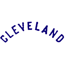
Cleveland Blues
1901 - 1902
Like most teams before the 1900's the logo was just a wordmark of the city "CLEVELAND."
The Historic Cleveland Blues Logo
A bold blue “C” defines the Cleveland Blues logo, symbolizing the city’s early baseball spirit. Its Cleveland Blues baseball club history highlights iconic Cleveland Blues baseball designs. Fans cherish its vintage charm. Additionally, check the Cleveland Blues alternate logo. It reveals more styles in this historic collection. Consequently, fans celebrate the team’s legacy.
The Cleveland Blues logo energized Cleveland Blues baseball games from 1879 to 1884. Rooted in Cleveland Blues baseball club history, it sparks nostalgia. Furthermore, its design ties to the modern Cleveland Guardians. Visit the official Cleveland Guardians MLB page. Discover the team’s legacy and updates. Therefore, fans connect with Blues pride.
The Cleveland Blues logo energized Cleveland Blues baseball games from 1879 to 1884. Rooted in Cleveland Blues baseball club history, it sparks nostalgia. Furthermore, its design ties to the modern Cleveland Guardians. Visit the official Cleveland Guardians MLB page. Discover the team’s legacy and updates. Therefore, fans connect with Blues pride.


