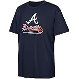
The Boston Bees primary logo captures the team’s unique MLB history. Featuring a bold “B” with a bee, the Boston Bees logo reflects pride. This collection of primary logos showcases the Bees logo legacy, uniting fans with Boston Bees baseball tradition from 1936 to 1940.

Boston Bees
1939 - 1940
The Bees logo went to an old English letter "B" in blue. The letter "B" stands for the city of Boston.
Boston Bees
1938 - 1939
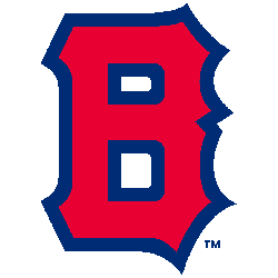
Same block letter "B" now in red with a blue outline. The letter "B" stands for the city of Boston.

Boston Bees
1937 - 1938
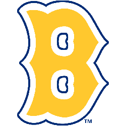
The logo changed to a block letter "B" again yellow with a blue outline. The letter "B" stands for the city of Boston.
Boston Bees
1936 - 1937
The logo changed to a block letter "B" again yellow with a blue outline. The letter "B" stands for the city of Boston.
The Distinctive Boston Bees Logo
A vibrant “B” with a bee defines the Boston Bees logo. Its Boston Bees baseball history highlights the unique Bees logo design. Fans admire Boston Bees hat designs featuring the logo. Additionally, check the Atlanta Braves alternate logo. It reveals more styles in this historic collection.
The Boston Bees logo energized Boston Bees baseball games from 1936 to 1940. Rooted in team history, the Bees logo on Boston Bees hats inspired fans. Furthermore, its design sparks nostalgia. Visit the official Atlanta Braves MLB page. Discover the team’s legacy and updates. Consequently, fans connect with Bees pride.
The Boston Bees logo energized Boston Bees baseball games from 1936 to 1940. Rooted in team history, the Bees logo on Boston Bees hats inspired fans. Furthermore, its design sparks nostalgia. Visit the official Atlanta Braves MLB page. Discover the team’s legacy and updates. Consequently, fans connect with Bees pride.