Baltimore Orioles
Smiling black and orange cartoonish oriole wearing a baseball cap sporting the Orioles alternate cap logo. Moved from alternate to primary in 2019.

Baltimore Orioles
2009 - 2019
The latest logo for Baltimore is an black, white and orange Oriole perched on "Orioles" scripted in orange with a black outline. The yellow and green baseball diamond has been removed from the background.
Baltimore Orioles
1999 - 2009
Scripted wordmark "Orioles" in orange with black drop shadow with an orange and black oriole on top of the letter "i" in front of a baseball in field with a white home plate in green and yellow.
Very subtle changes to colors, as the logo did not change.
Baltimore Orioles
1998 - 1999
In 1998 the logos only changes were to the oriole bird on top of the scripted "Orioles." A redesign of the oriole gives it more features and definition, still in orange, white and black.
Baltimore Orioles
1995 - 1998
The 1995 logo featured a Oriole bird now facing to the right standing on "Orioles" scripted in black and orange with a yellow and green baseball diamond in the background.
Baltimore Orioles
1992 - 1995
In 1992, the Orioles logo was a black, white and orange Oriole bird on top of "Orioles" script with the wordmark "Baltimore" inside scripts tail.
Baltimore Orioles
1989 - 1992
Only slight changes to color for the 1989 logo.
Baltimore Orioles
1966 - 1989
Designer Stan Walsh creator of such unforgettable icons as the Hamm's Bear and Snap, Crackle and Pop now worked on the next Orioles logo. He changed the orange, black and white oriole bird to swinging a bat and wearing cleats in an orange circle with a wordmark "BALTIMORE ORIOLES."
Baltimore Orioles
1954 - 1966
First logo in Baltimore featured a smiling orange, black and white oriole perched on a white baseball. The wordmark "ORIOLES" on top of the baseball with two bats criss-cross behind the ball.
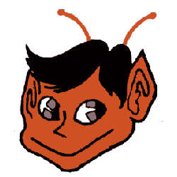
St. Louis Browns
1952 - 1953
Change of logo to Brownie the Elf in orange, black and brown with two antennas.
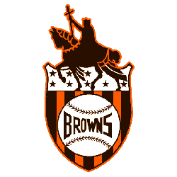
St. Louis Browns
1936 - 1952
This marks the first logo without a letter or city name. Statue of Saint Louis on horseback holding his sword mounted on top of a shield. The shield has brown stars on the top with orange and brown strips. On top of the strips is a white baseball with the wordmark "BROWNS."
St. Louis Browns
1916 - 1936
For this logo they drop the "t" to just have the letters "SL" in brown. The acronym "STL" stands for the city of St. Louis.
St. Louis Browns
1911 - 1916
A new combination of the city acronym "StL" again in brown. The acronym "STL" stands for the city of St. Louis.
St. Louis Browns
1908 - 1911
The Browns changed their logo to a brown fleur-de-lis logo.
St. Louis Browns
1906 - 1908
A brown 'STL' inside a brown and white diamond. The acronym "STL" stands for the city of St. Louis.
St. Louis Browns
1902 - 1906
The first logo for St. Louis Browns was "ST.L" with the period being below the "T" in the color brown. The acronym "STL" stands for the city of St. Louis.
Milwaukee Brewers
1900 - 1901
Like most teams before the 1900’s the logo was a wordmark of the city “MILWAUKEE” in a arched pattern.
Baltimore Orioles Logo History
The Baltimore Orioles primary logo shines in MLB games, embodying the team’s competitive heart. Its bold colors and sleek style, built on the old Baltimore Orioles logo, inspire fans. The Baltimore Orioles logo history reflects decades of triumphs. Visit the official Baltimore Orioles MLB page to explore the team’s legacy, roster, and latest updates.
"Step Up to the Plate in Style!"
Don't get caught looking—score the latest 2026 City Connect jerseys, authentic on-field caps, and limited-edition vintage threads. Officially licensed gear for every true fan of the game.
Hit a Home Run – Shop MLB Official Gear

Time to Vote Orioles Fans
Venture into the thrilling world of the MLB Team Logo Battle, where the Baltimore Orioles logo, a vibrant symbol of our unwavering dedication and enduring perseverance, competes against the emblems of rival teams. Our logo, featuring the iconic Maryland bird, is not just a logo but a beacon of hope, a testament to our team's fighting spirit. This design, bursting with color and life, encapsulates the very soul of Baltimore - robust, resilient, and undeniably passionate. As Orioles fans, we proudly wear this emblem, reflecting our steadfast loyalty and spirit. Join us in this exciting face-off as our logo vies for supremacy, personifying the relentless courage of the Baltimore Orioles and their ardent supporters. Let's show them our logo isn’t just distinctive; it symbolizes a legacy of determination and pride!
