Toronto Blue Jays
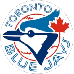
Blue jay head in two shades of blue (royal and navy) with a large red maple leaf on the right side. Former alternate logo.
Blue Jays Primary Logo
The Toronto Blue Jays are one of the most iconic baseball teams in Canada, and their primary logo has been an integral part of their identity since they began playing in 1977. The original primary logo was a simple blue jay head, wearing a red cap with white trim and the word "Jays" written across it. This logo remained largely unchanged until 1997 when they introduced a new version featuring two overlapping circles containing the bird's head along with cursive lettering spelling out "Blue Jays". This design would remain as the official primary logo for almost 20 years before being replaced by another classic look in 2016.
Throughout its history, Toronto Blue Jays' Primary Logo has seen many changes yet managed to retain much from previous designs while also evolving into something new every time - making sure fans can always recognize them no matter what era they come from or how far away they may be! It's safe to say that these classic looks will stay around for many years ahead as well so long as people continue enjoying watching Canada's favorite team play ball at home plate!

Toronto Blue Jays
2012 - 2020
The current logo was created by the Toronto Blue Jays with the assistance of the Design Services division of Major League Baseball led by Anne Occi, Vice President of Design. The Blue Jays primary logo featured a Blue Jays bird head with the red Maple Leaf and white with red seams and outlined baseball in the background, an arched solid blue font "TORONTO" above and scooped new split letters "BLUE JAYS" font in blue below. The logo is fully encased in a blue and white split line circle.

Toronto Blue Jays
2004 - 2011
Brandid, a Toronto-based firm, was selected in early 2002 to design the teams next primary logo, that would form the launching point for the re-branding process. The end result is a newly styled blue jay extending to the left from “Jays” lettering based on traditional baseball wordmark with three-dimensional metallic blue, silver and white letters.
Toronto Blue Jays
2002 - 2004
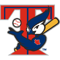
This Toronto logo featured an animated Blue Jay holding a yellow bat and reaching around a large red "T" with a blue center outline, tossing a white with red seams baseball in the air. The arm of the blue jay tossing the ball displays a red maple leaf on the his shoulder.

Toronto Blue Jays
1997 - 2002
In 1997 the Blue Jays adopted a new team logo. The logo was designed by Major League Properties and brought the color red into prominence as a red with dark blue and light blue trim maple leaf served as the backdrop for the logo. On top of the maple leaf is a white with a red seam and blue trim baseball and a blue jay on top of the baseball. A wordmark "BLUE JAYS" in dark blue and light blue, with the "B" and "S" larger than the other letters.

Toronto Blue Jays
1994 - 1997
A blue jay on top of a white baseball with red seams and a red maple leaf in the top right corner. A split letter blue font for the encircled wordmark "TORONTO BLUE JAYS."
Adjustments were made to the letters "Y" and "S" and the stitches in the baseball.
Designed by Toronto based Savage Sloan Ltd.
Toronto Blue Jays
1977 - 1994
A blue jay on top of a white baseball with red seams and a red maple leaf in the top right corner. A split letter blue font for the encircled wordmark "TORONTO BLUE JAYS."
Designed by Toronto based Savage Sloan Ltd.
Baseball Sports Fan Products
